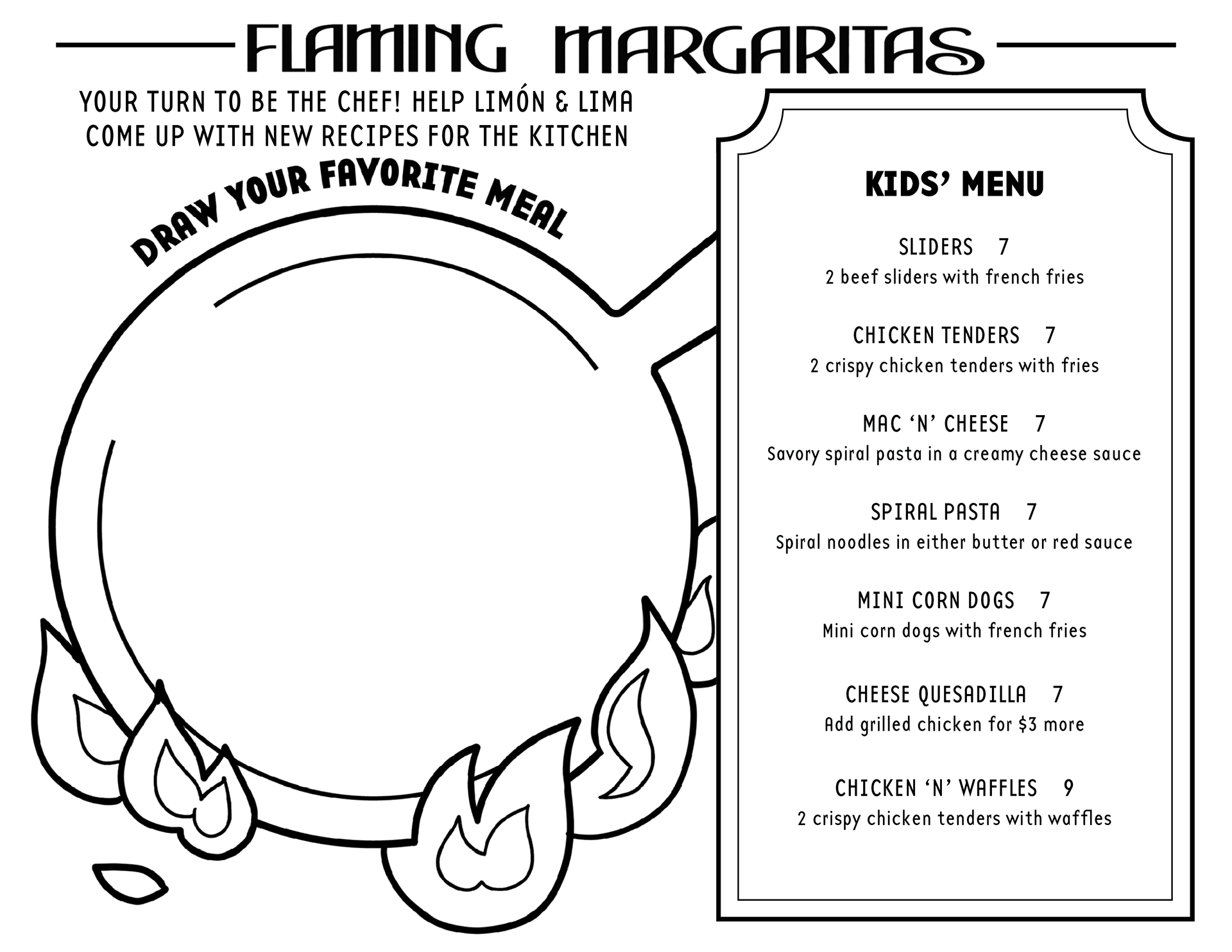
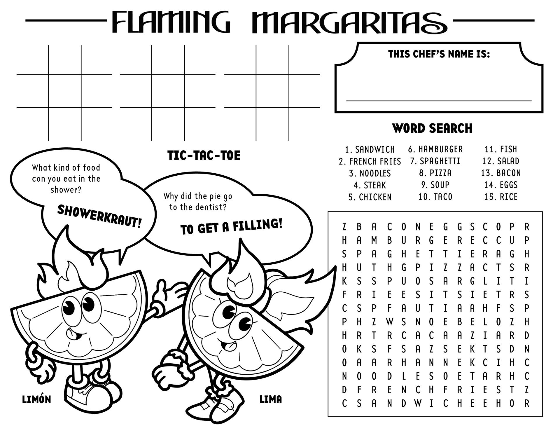
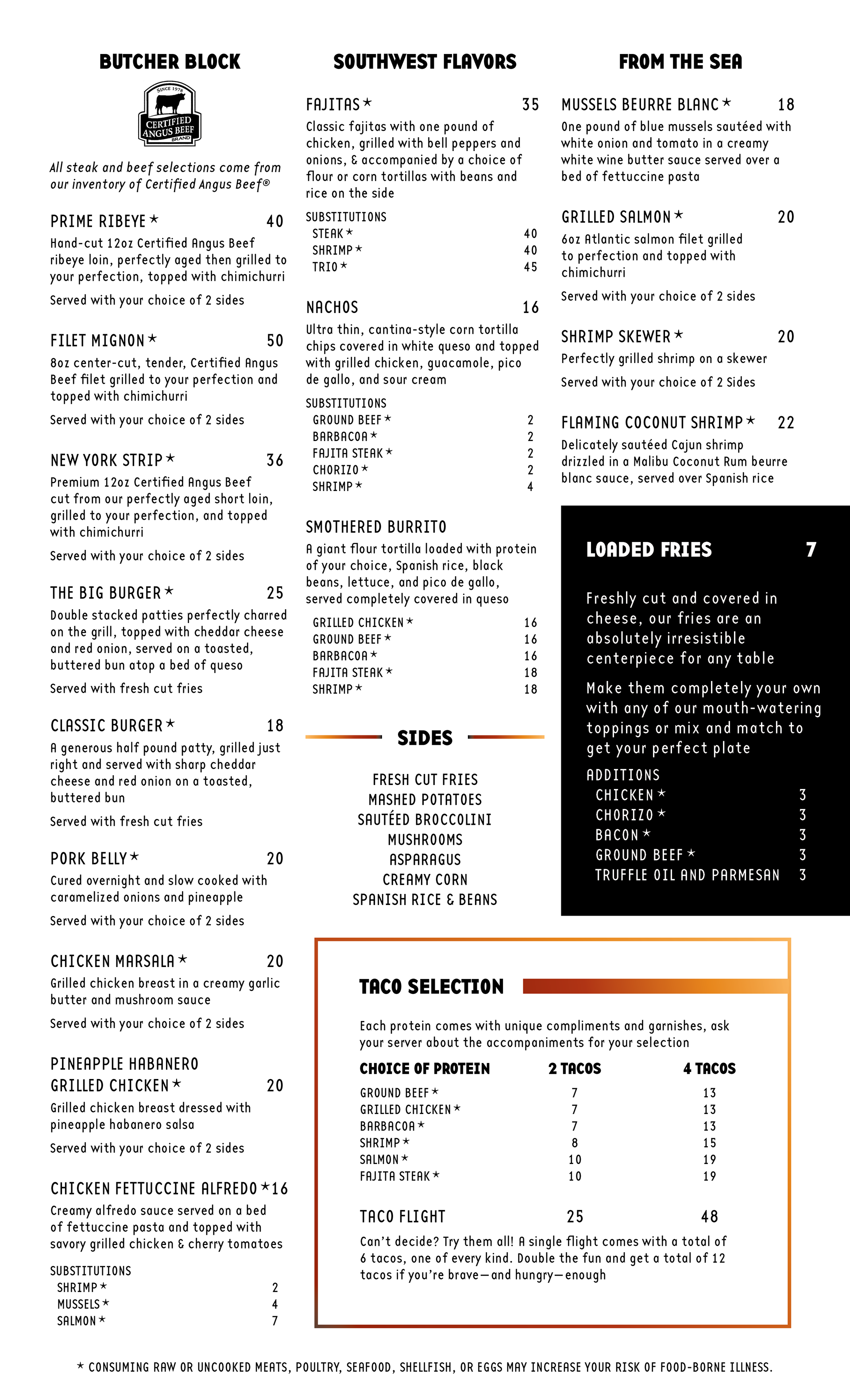
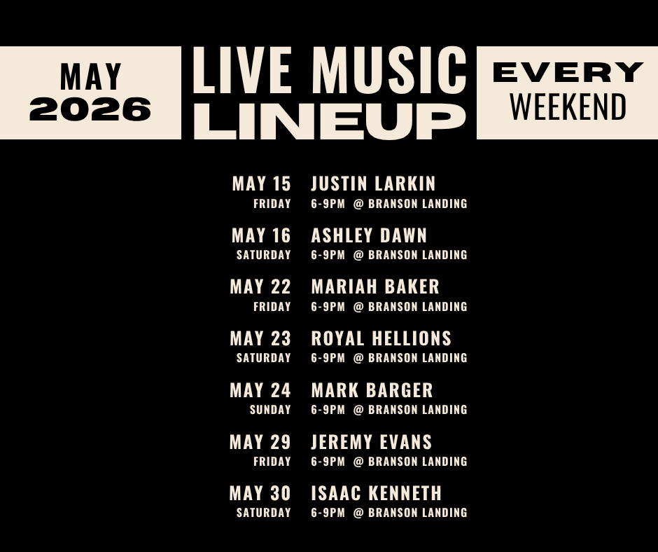
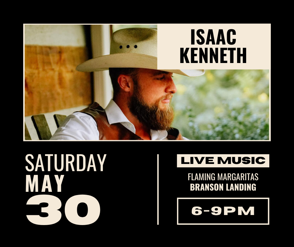
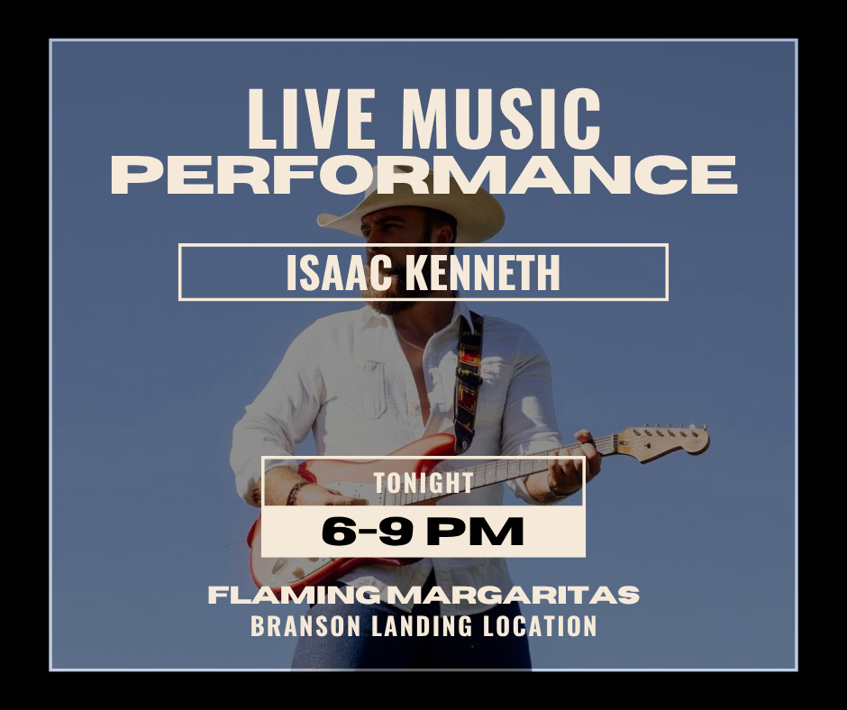
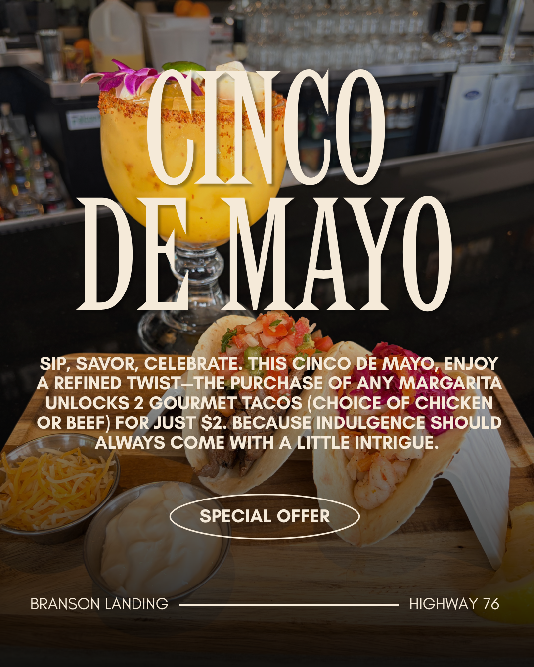
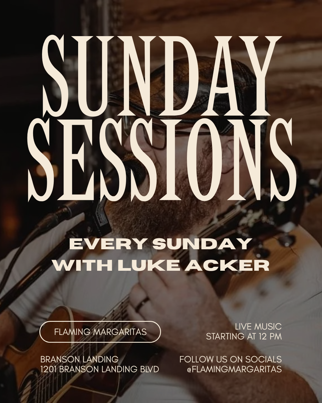
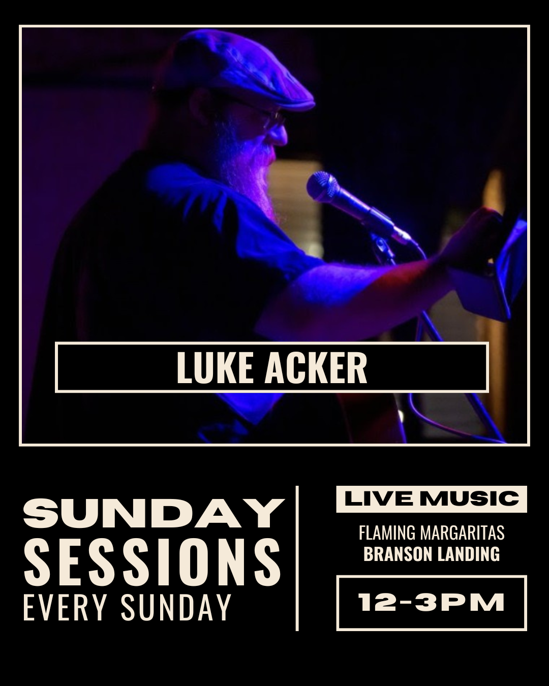
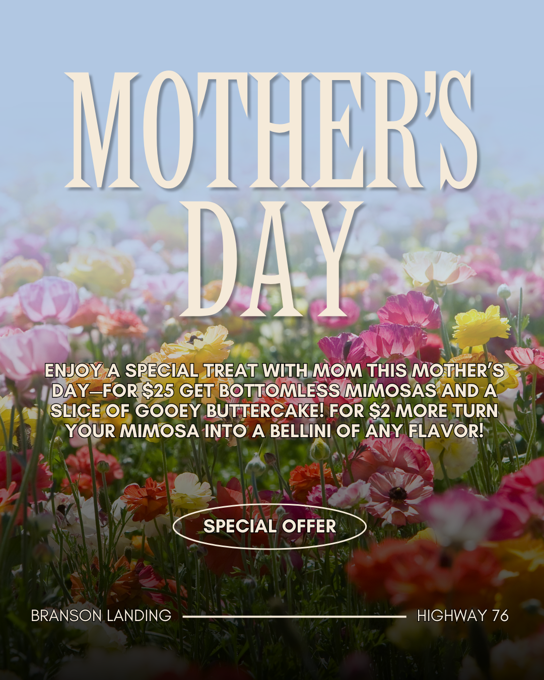
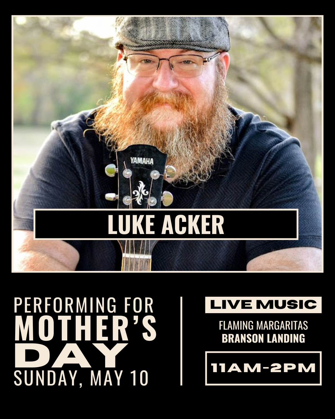
FLAMING MARGARITAS ENTERPRISES
Developed branding, menus, and social media for the company as it expanded from a two-location restaurant into a corporate chain. Oversaw multiple phases of branding development, change, and implementation. Developed bespoke designs for kids' menus, including mascot characters and activities. Utilized print, social, and digital means of visual information display and promoted specials run for holidays and events at the restaurant level.
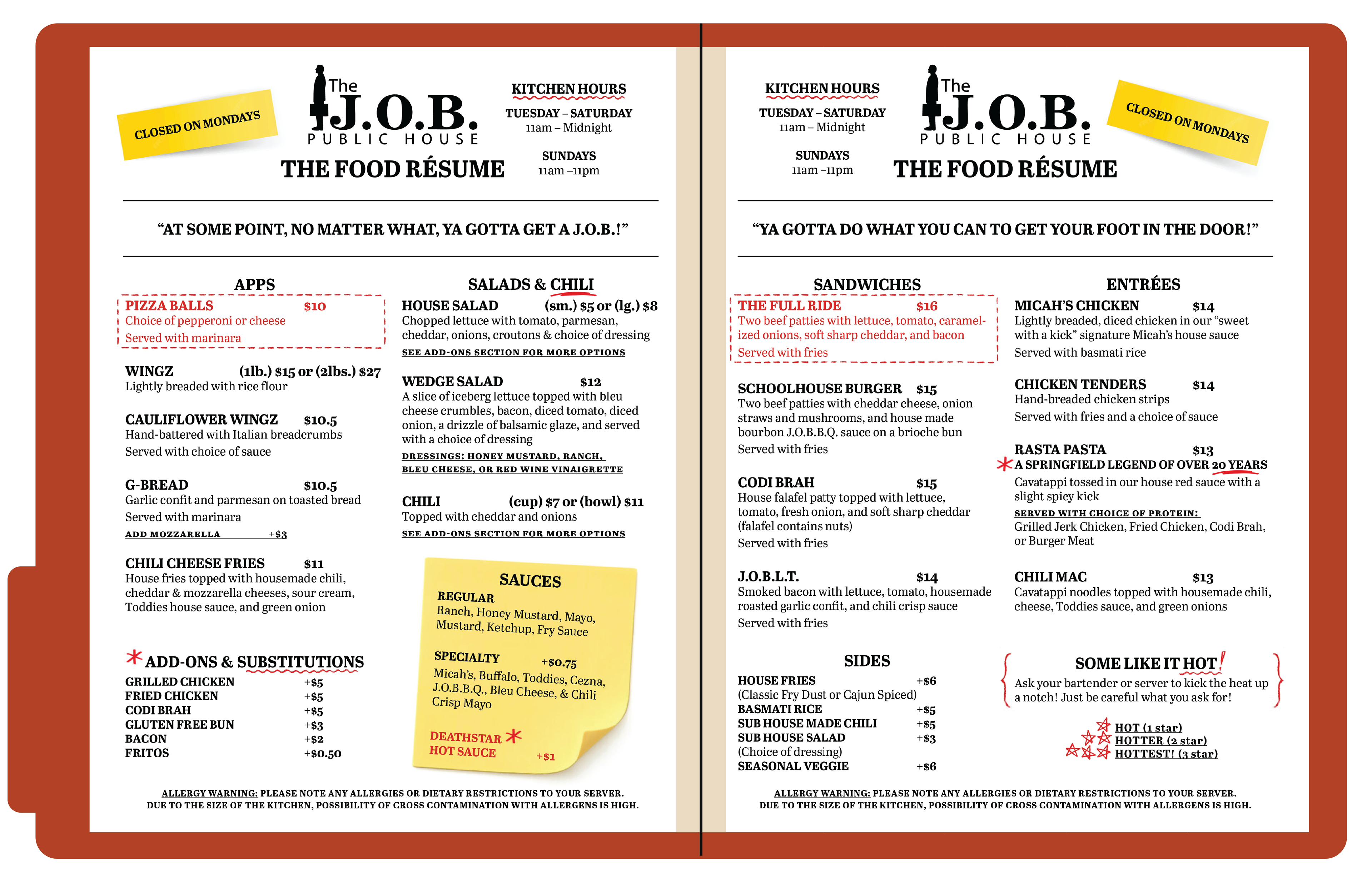
J.O.B. PUBLIC HOUSE MENU
J.O.B. Public House needed a new menu that did not drastically alter their existing branding voice, but would be easily replicated and relatively cheap to implement. The menus were made to resemble a resume, as the restaurant had once been part of a pair of locations sharing a common theme of graduation and career life (Grad School Burgers & the J.O.B. Public House). The finished design was able to be printed in-house, laminated, and placed in branded red file folders.
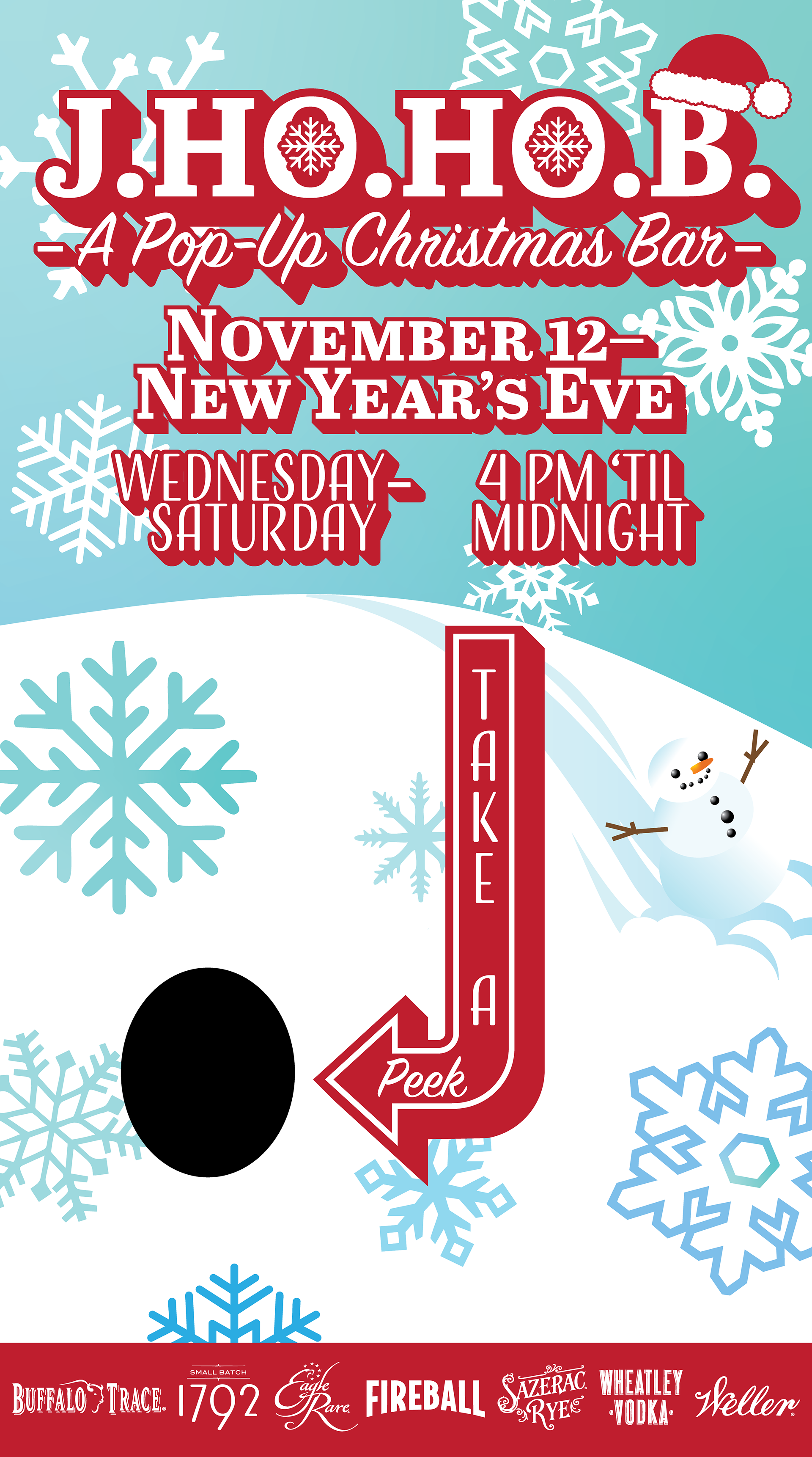
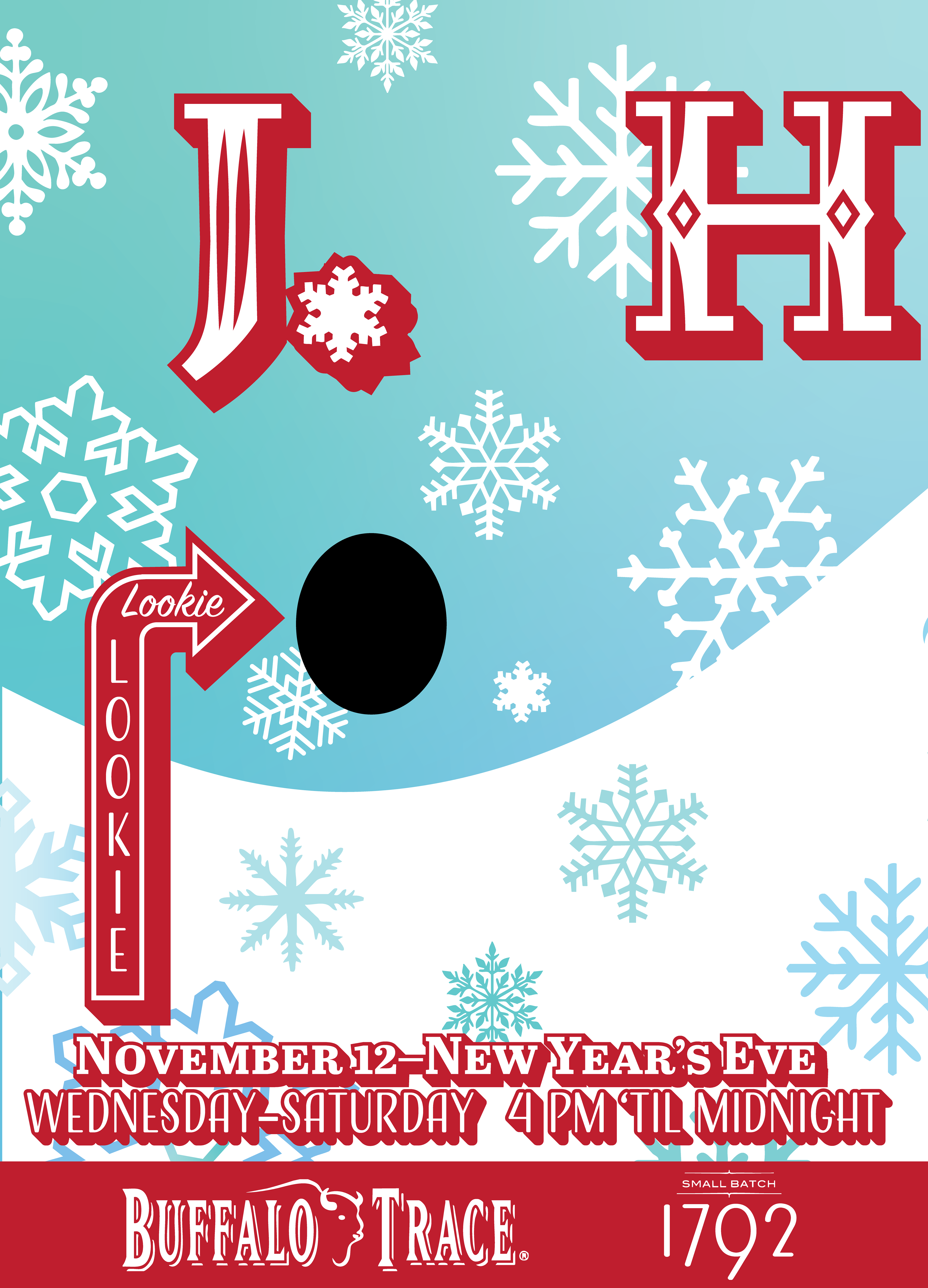
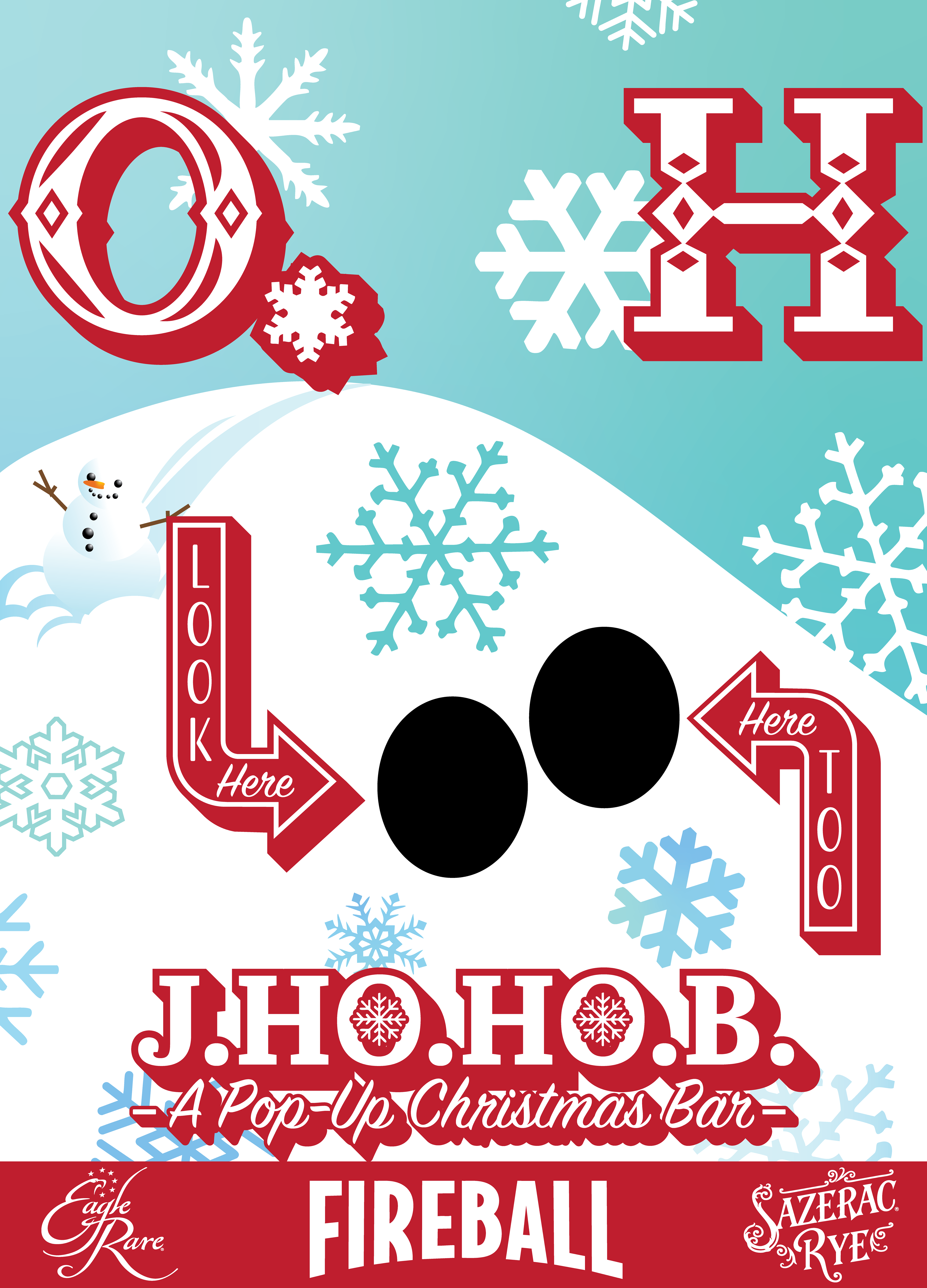
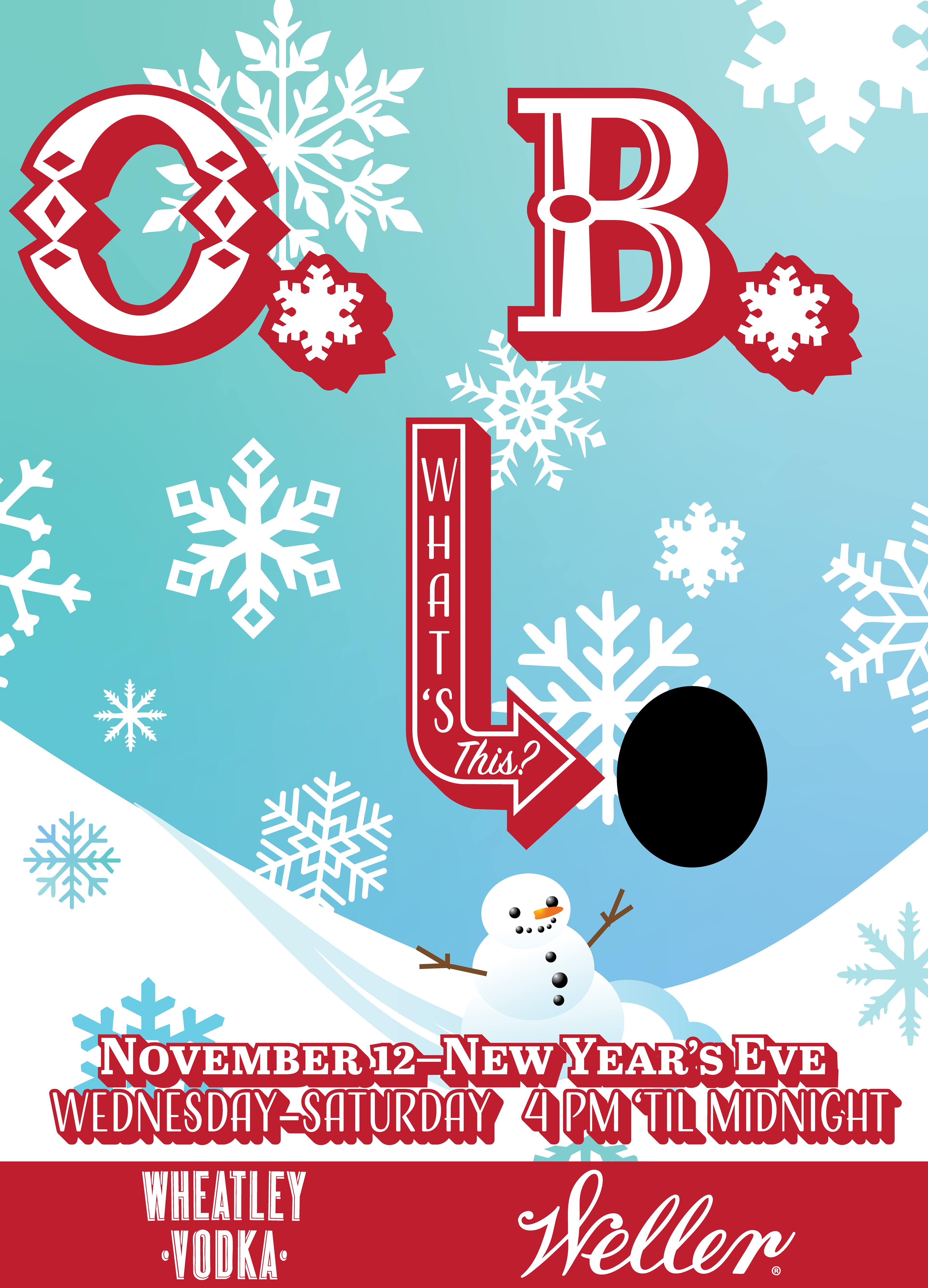
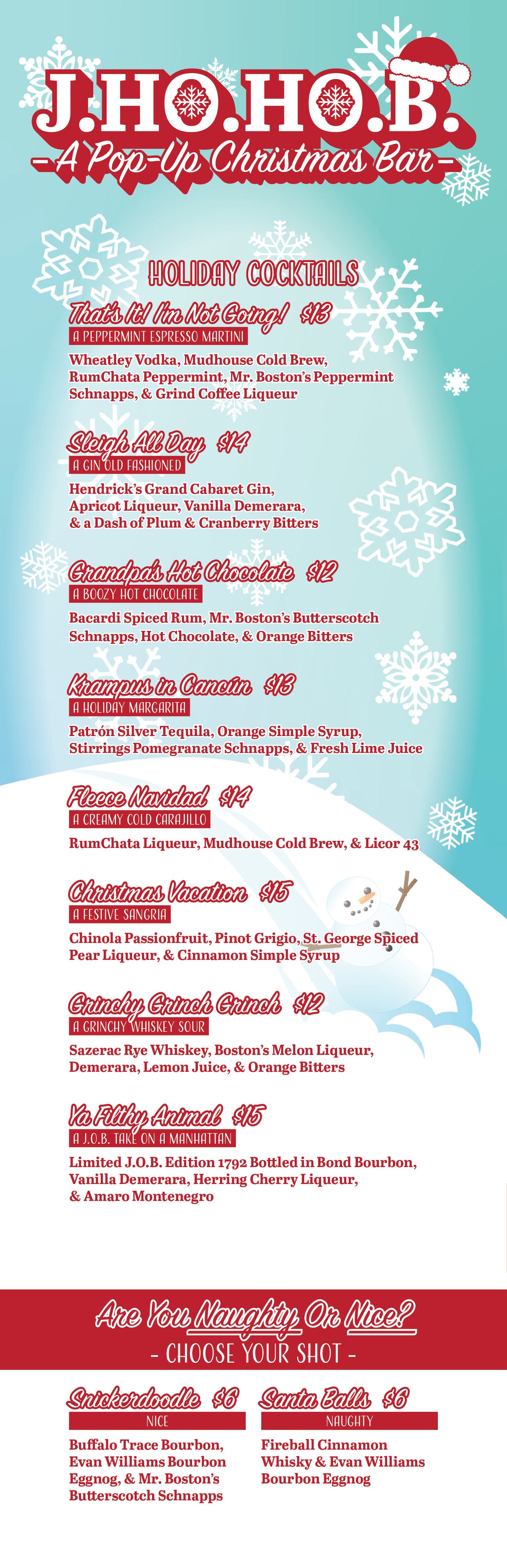
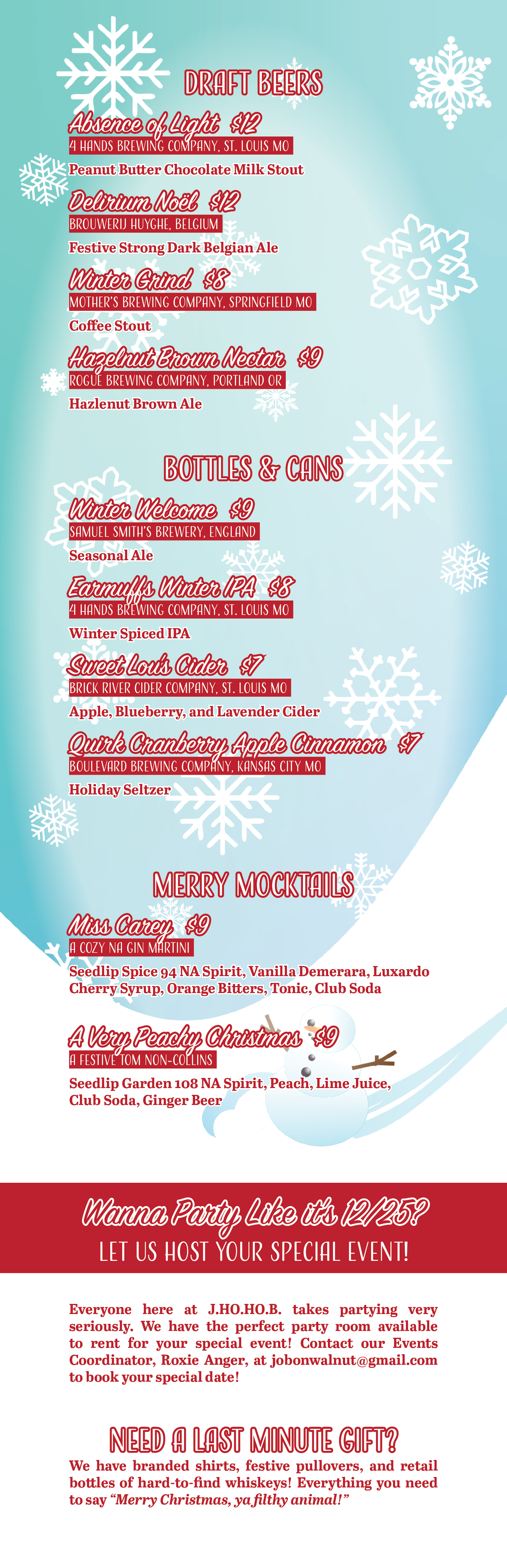
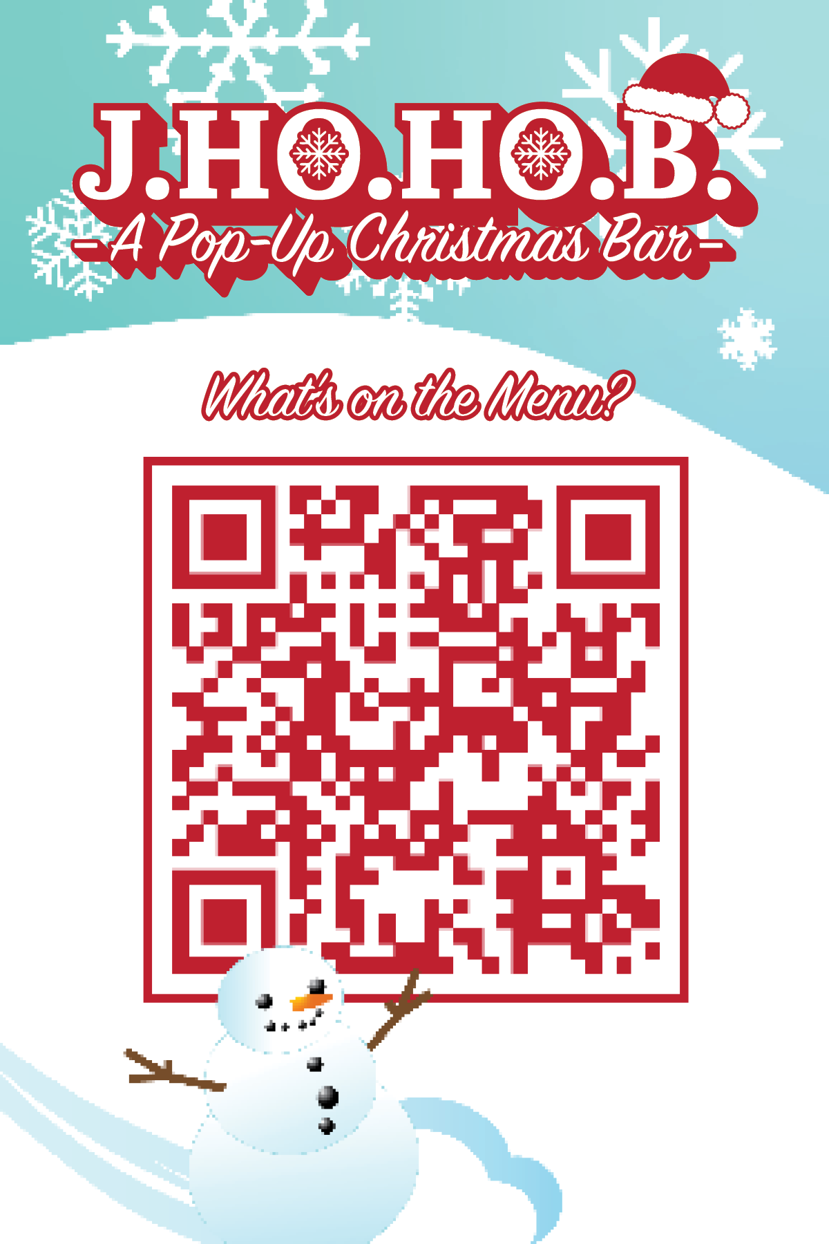
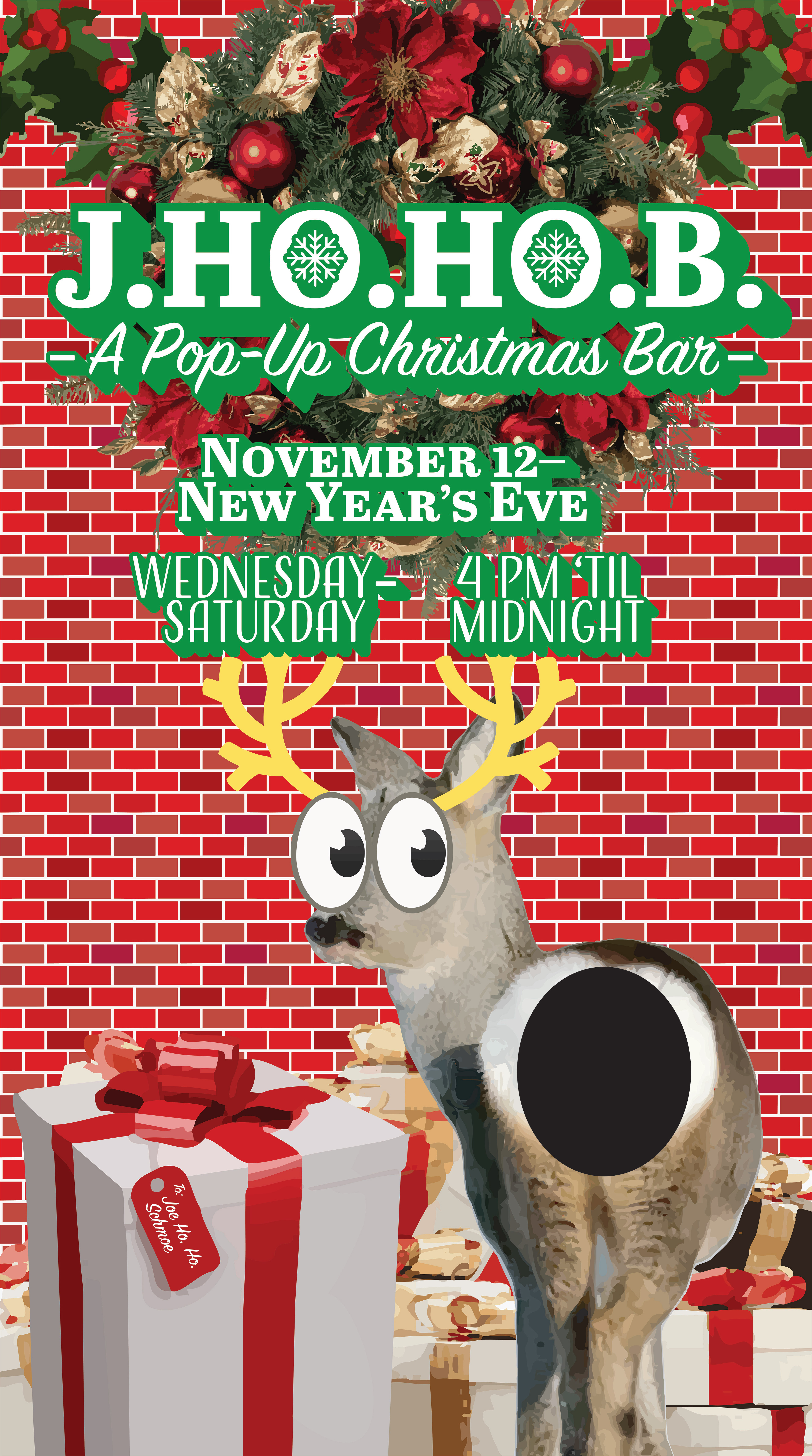
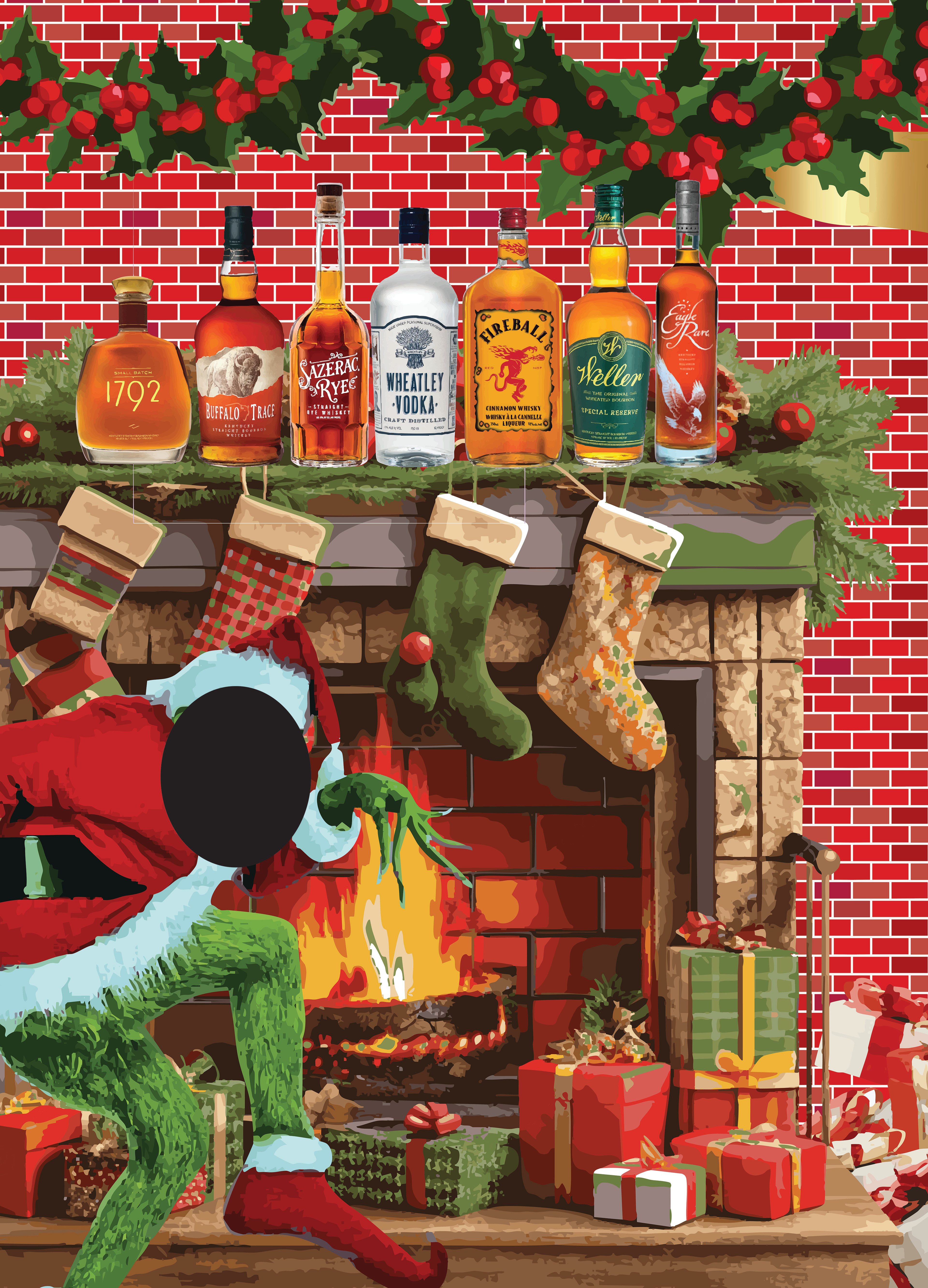
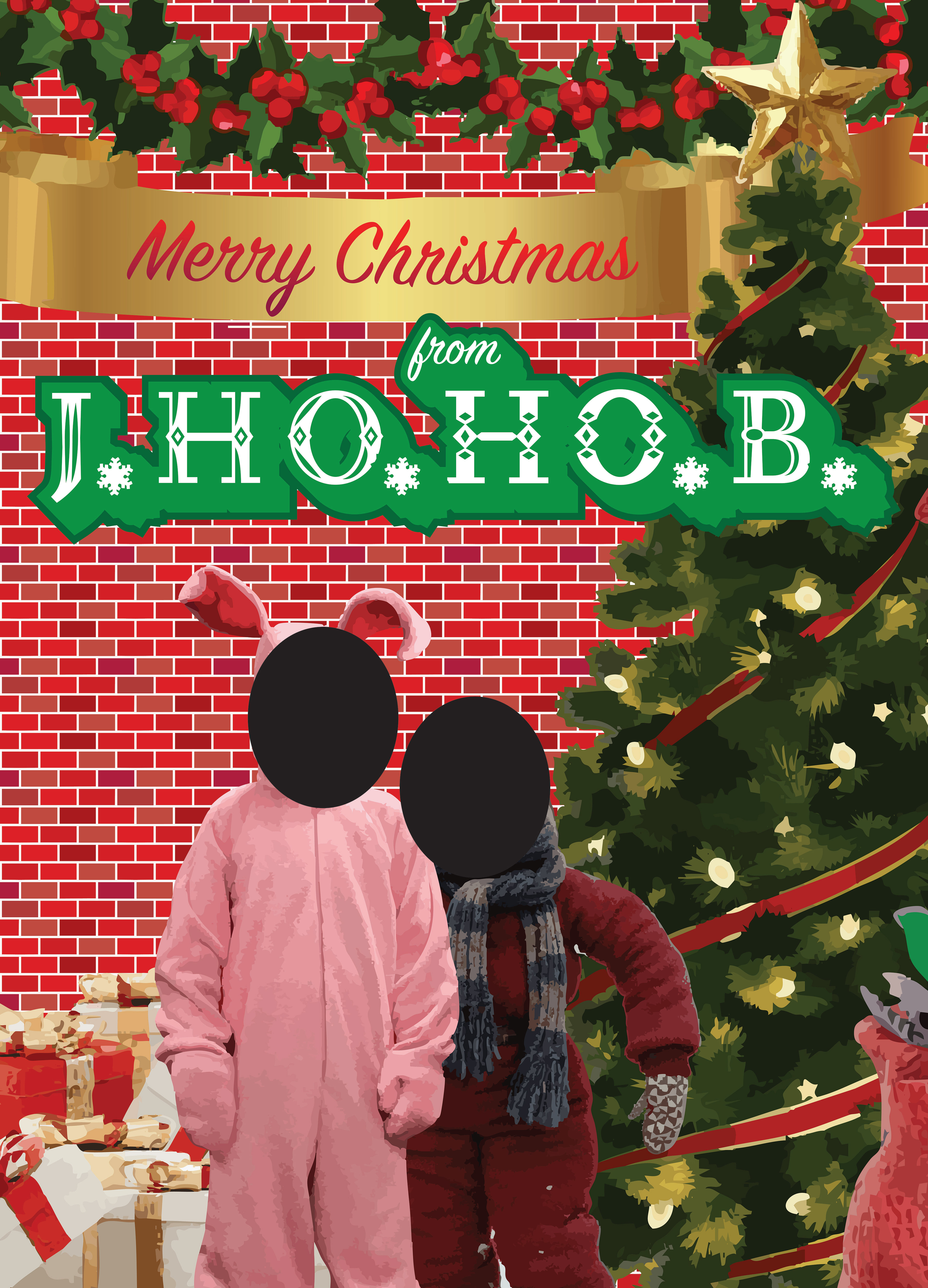
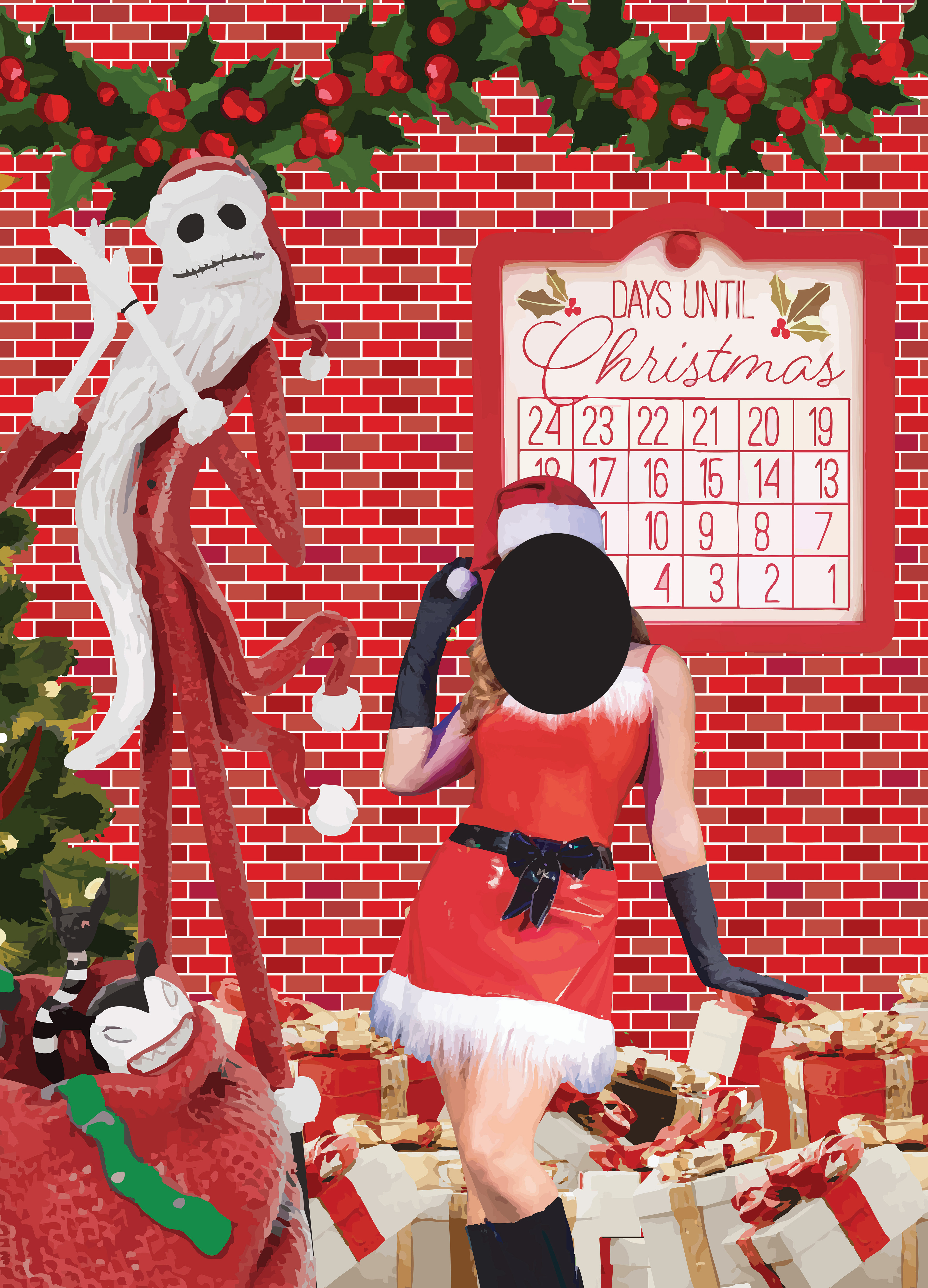
J.HO.HO.B. CHRISTMAS POP-UP BAR
Reusable window wraps were created for the street-facing and interior-facing sides of the window, with holes cut through both sides so that guests could peek into the interior and be seen as classic Christmas movie characters from the perspective of seated customers within. Corresponding branding was created to reflect the exterior window wraps, which was used on physical menus, printed QR code stands, and on a digital menu.
Elements from brands sponsoring the event were included in the overall design for both the interior and exterior wraps.
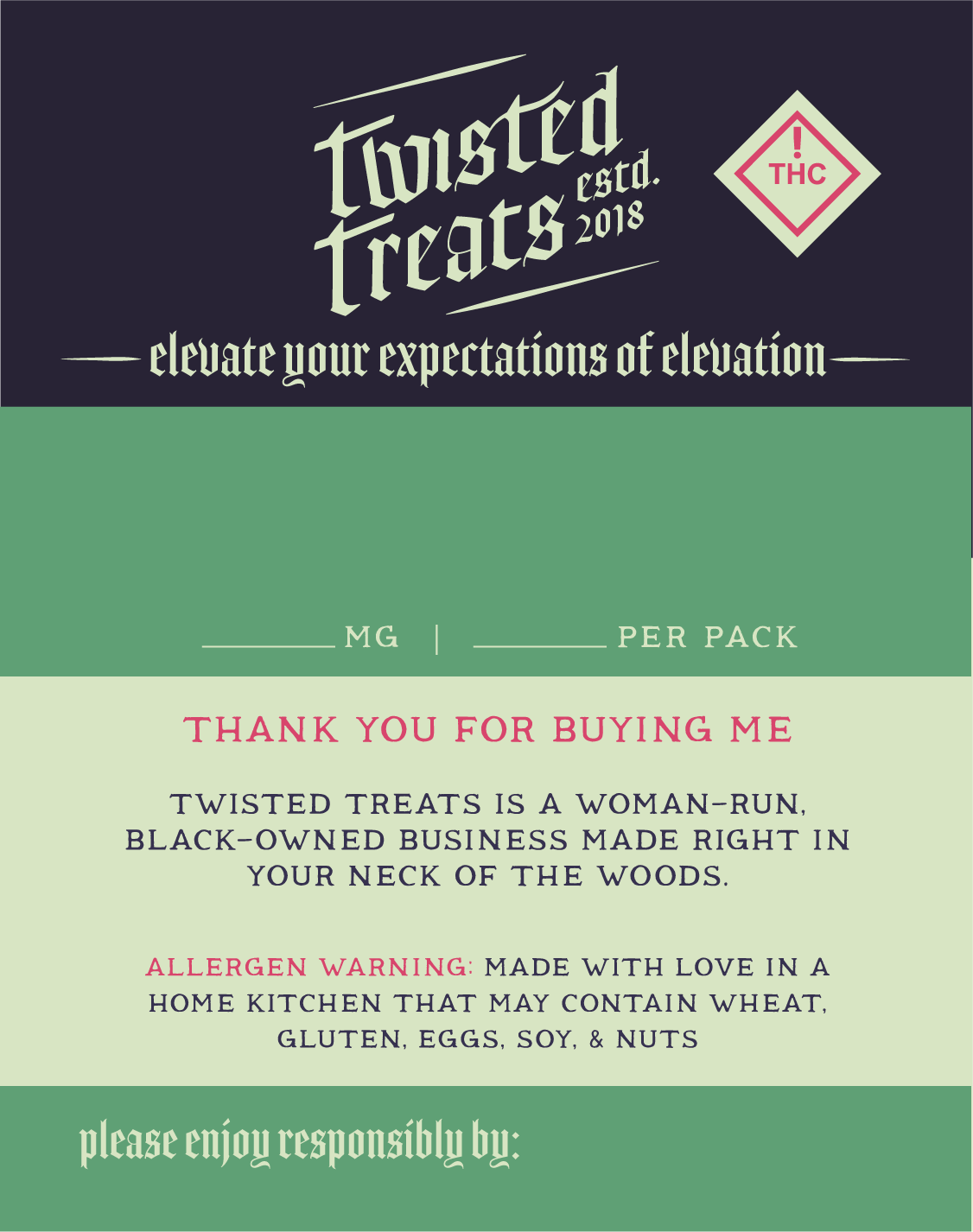
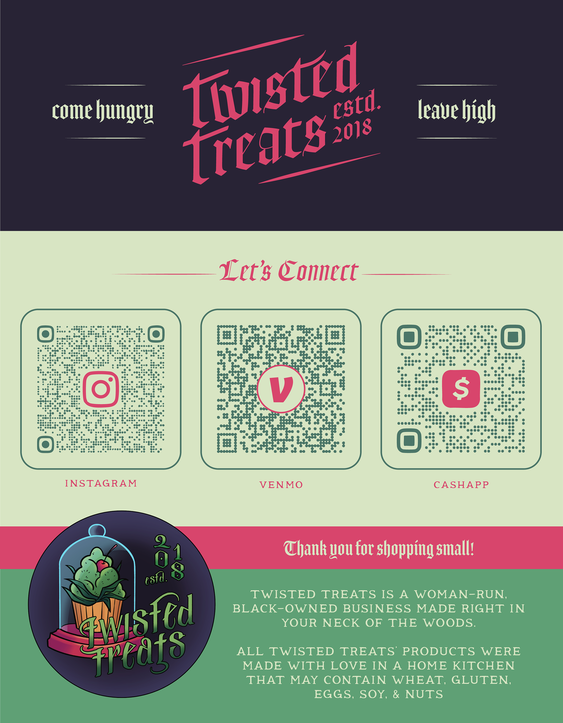
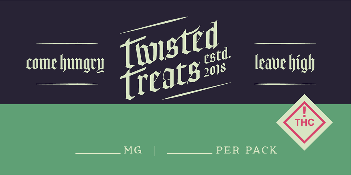
TWISTED TREATS
Labels were created that could be used in a versatile manner on multiple forms of packaging such as resealable zipper-topped treat pouches, rectangular single-use drink containers, single use film treat wraps, and cardstock goodie boxes. Due to the home-kitchen nature of the business, a multi-use label which could be filled out by hand fit the needs of the client best, as the business produces many holiday-themed and seasonally rotating flavors of many different kinds of treats. With this treatment, the business was able to buy labels in bulk that they could then handwrite specifications for each treat including treat type, flavor, MG content, or even amounts/volume.

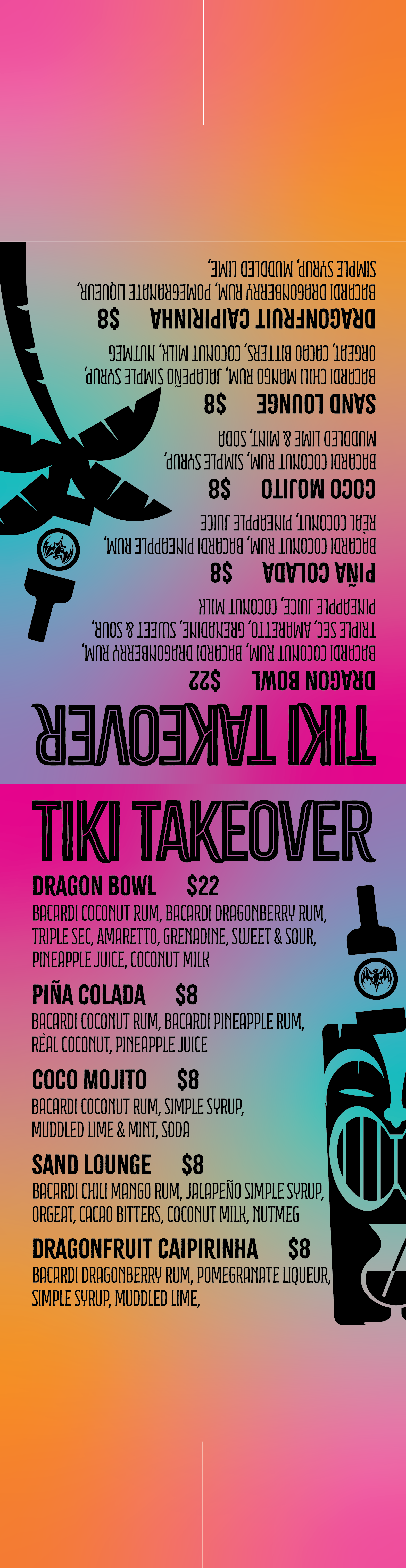
MUDLOUNGE
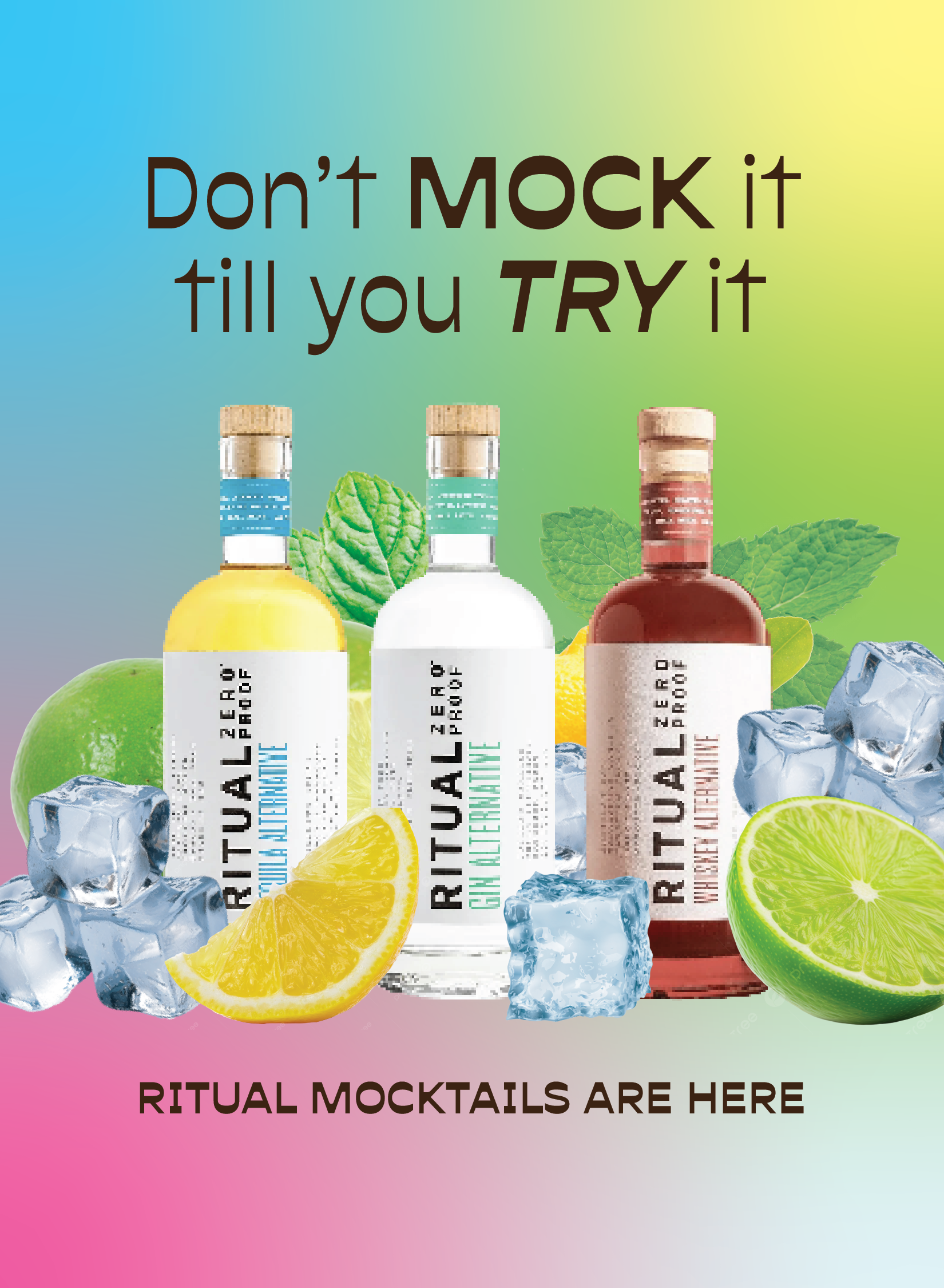
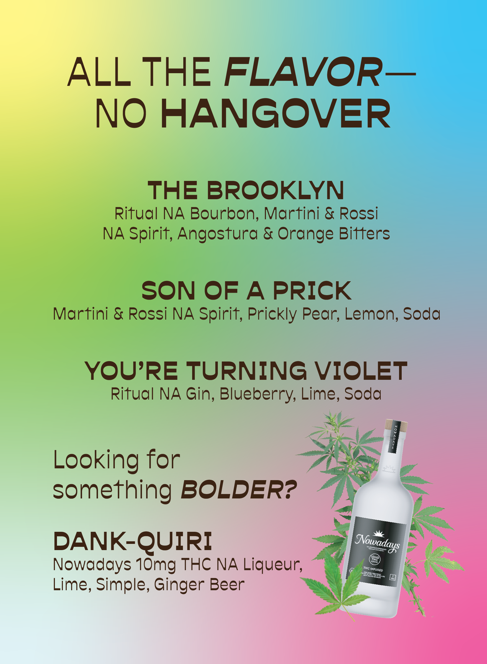
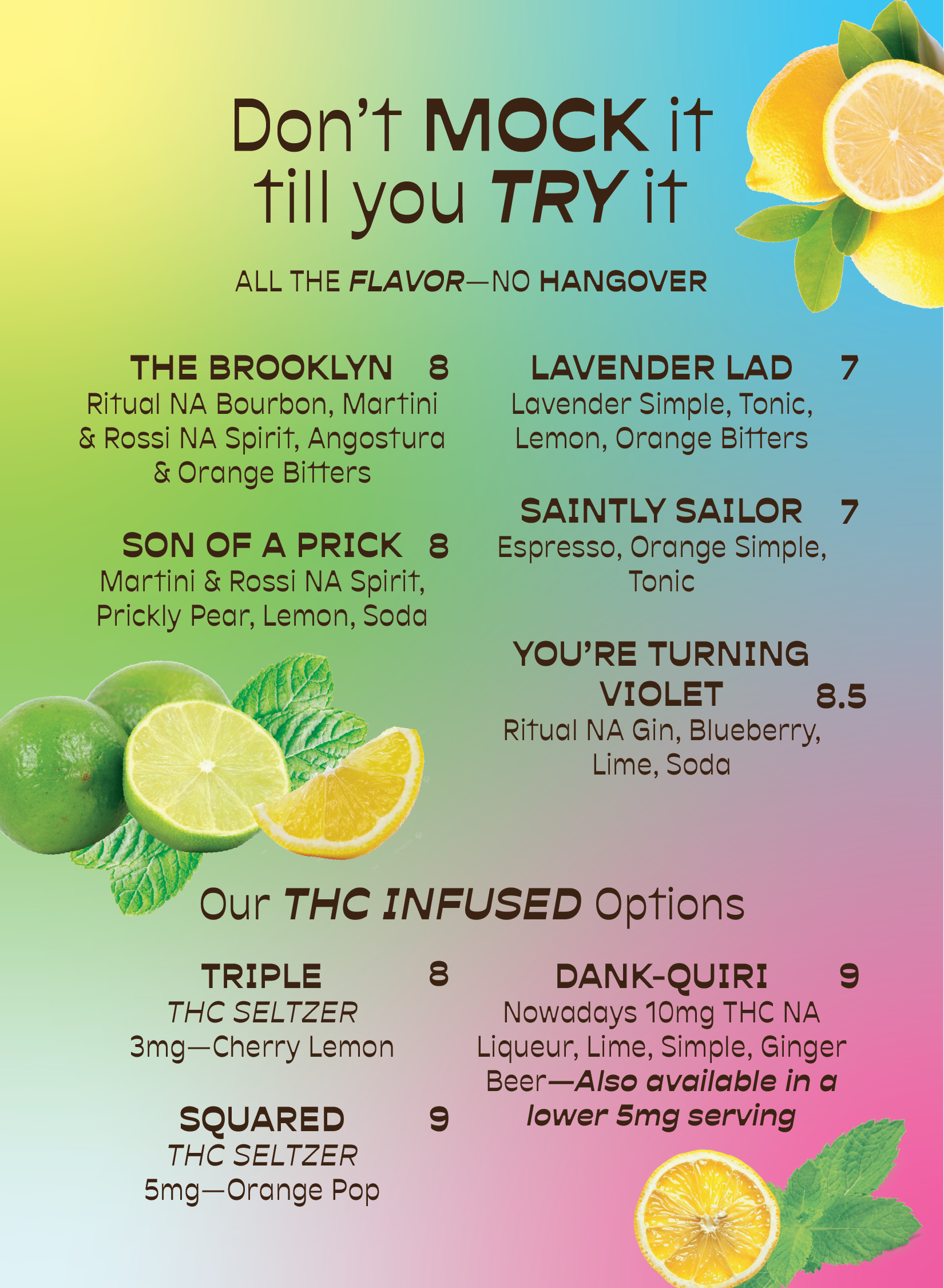
A sponsored, summer-long event was held by a liquor distributing company for Mudlounge, a local Springfield downtown bar. The scope of the event was a patio "takeover" wherein the distributor would purchase decorations, pay for printed advertising, and sponsor the event with their product featured at the forefront for the specialty drinks created and promoted during the event. Custom event branding was implemented for flyers, posters, menus, and an oversized printed outdoor menu banner to be displayed among the decorations. Self-folding table tents and printed menus were created to reflect the tiki-themed branding.
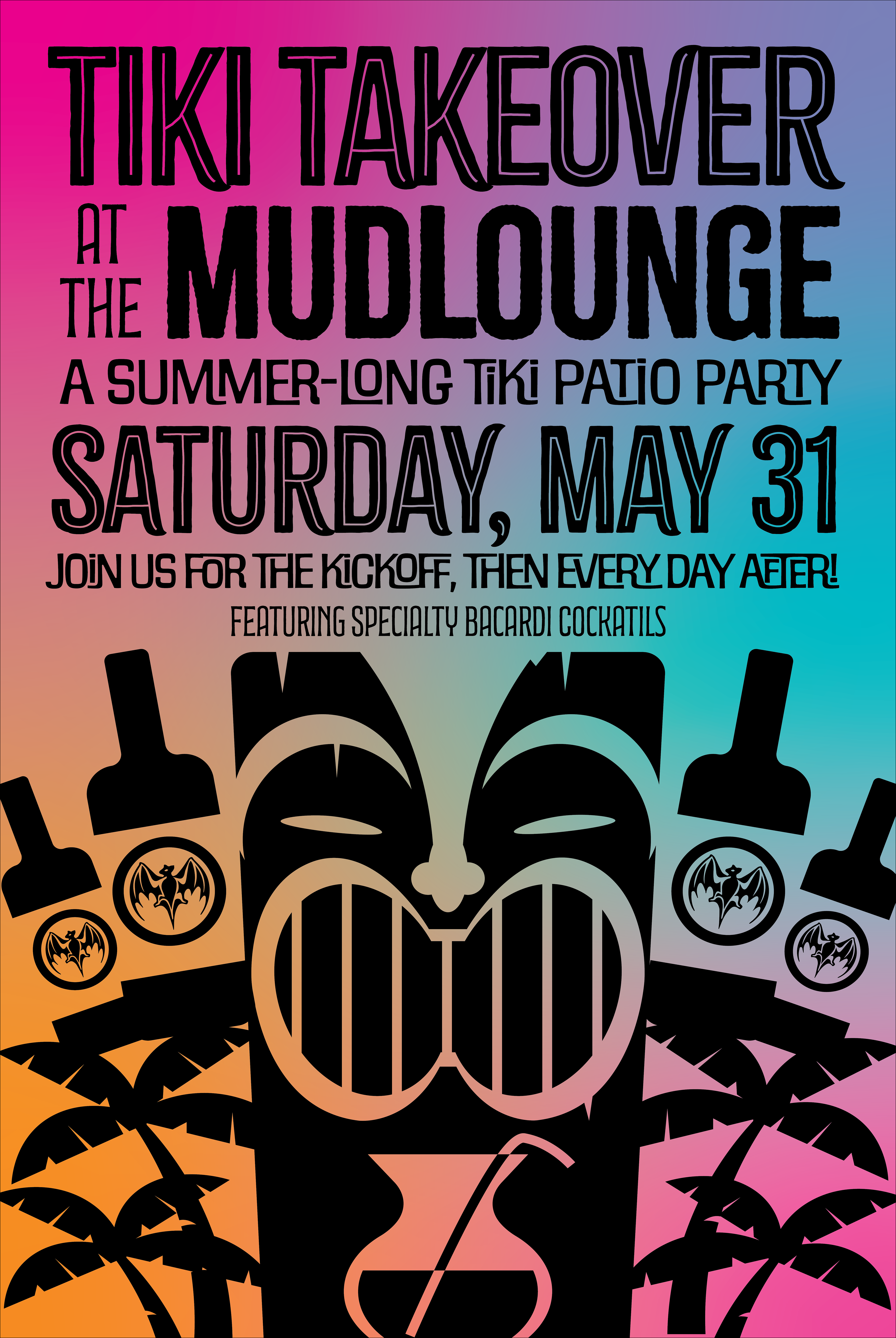
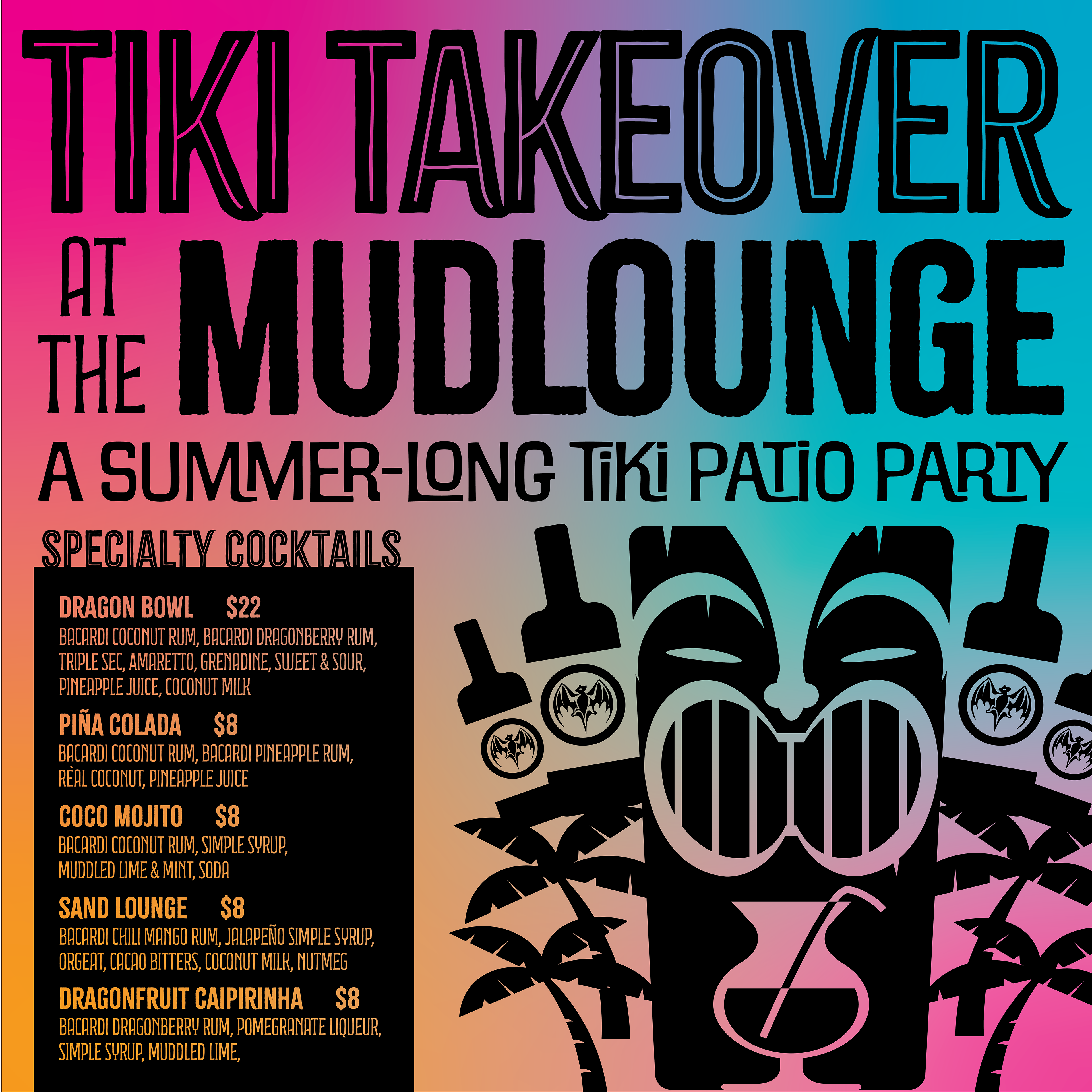
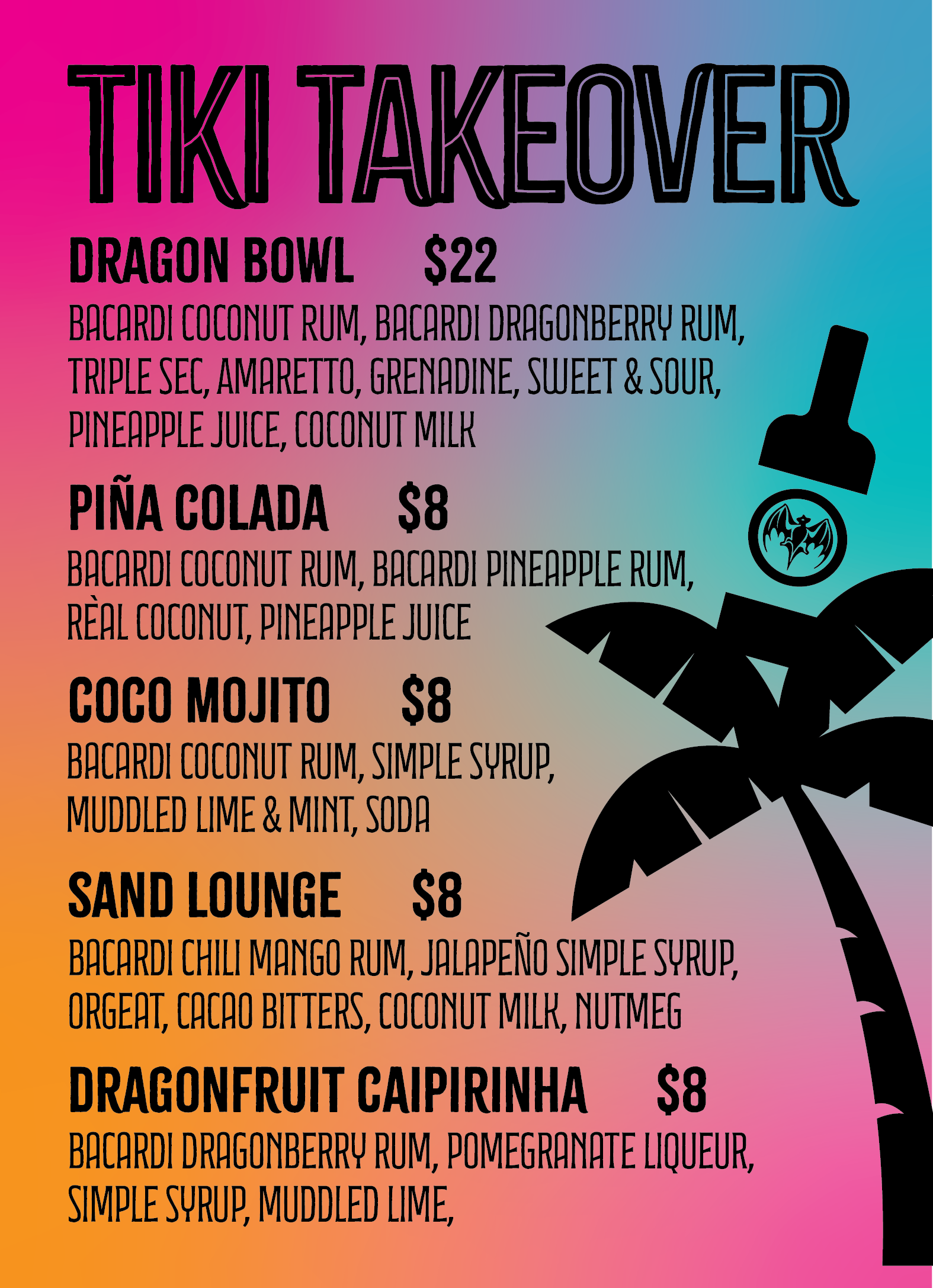
At the same time, THC-based liqueurs had been made legal the same summer. A mocktail menu with THC-infused options was also implemented for Mudlounge. A similar look and color scheme was utilized so that the two events, running concurrently, would not visually clash with one another.
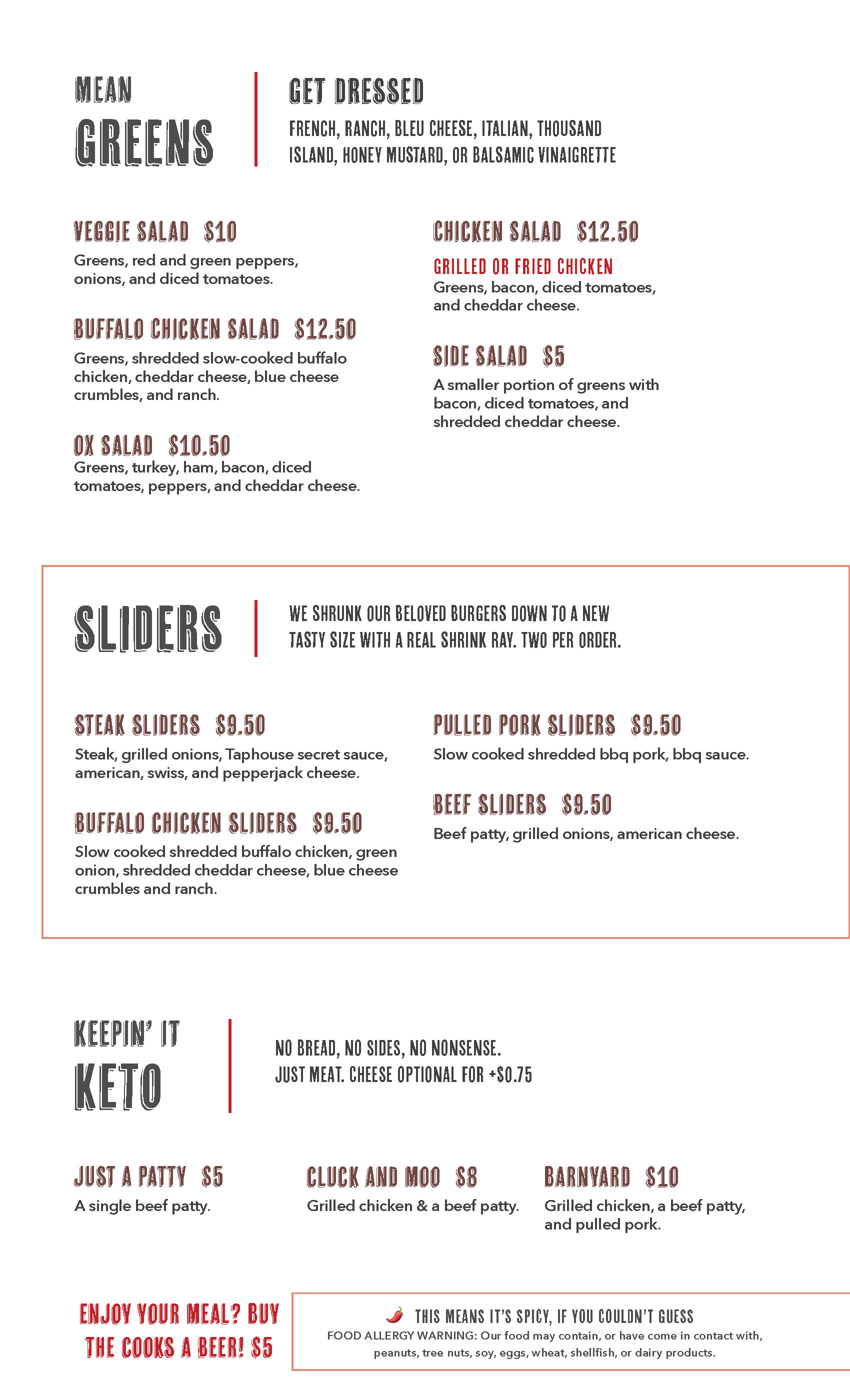
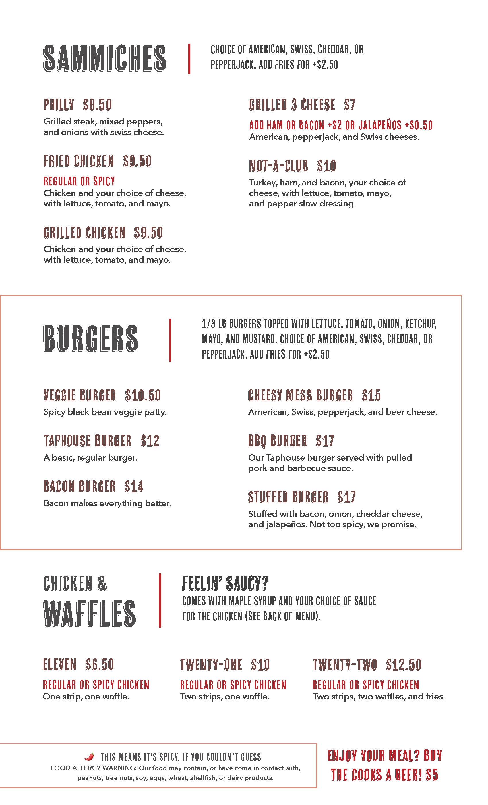
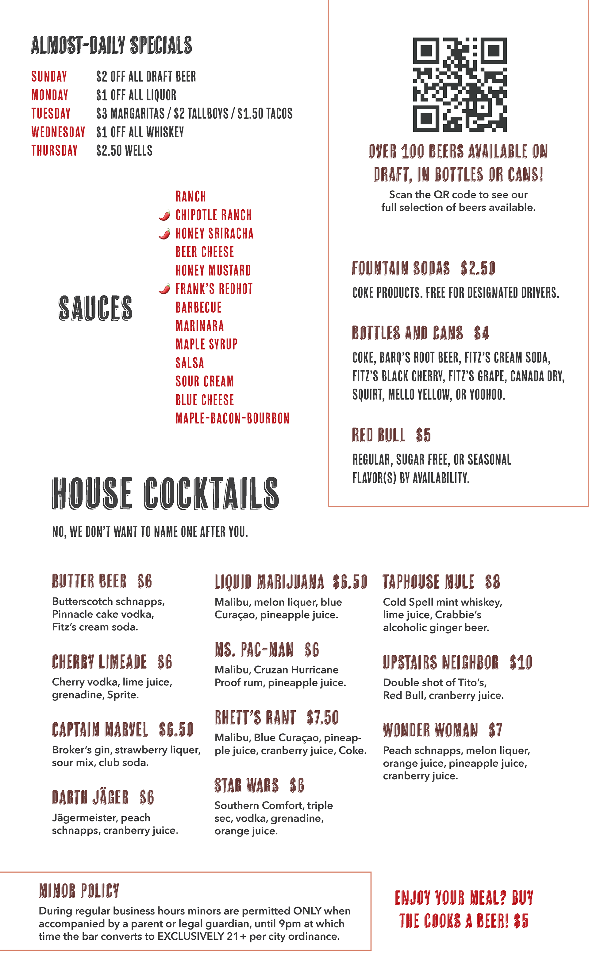
417 TAPHOUSE
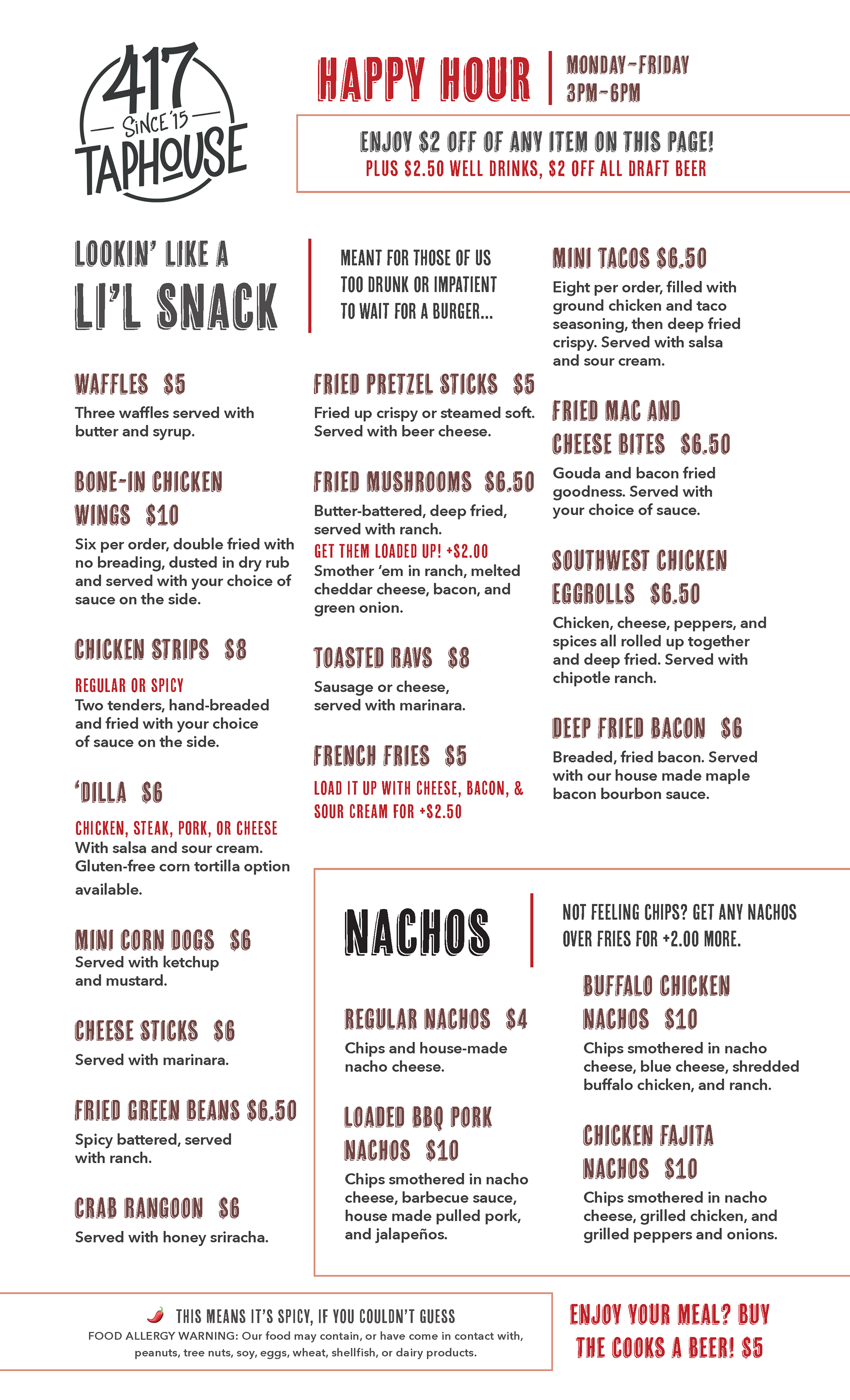
After an ownership changeover, 417 Taphouse was in need of new branding, as the old branding was no longer viable after the company restructure. A new logo was created for the restaurant, and along with it a new menu was needed. In order to reduce costs, the old 4-page leather and plastic menu holders were still required to be used, with the only physical changes being made to the designs of the pages themselves. As Taphouse boasted a dimly lit, "moody" atmosphere, a common complaint with the old menu was poor readability for older customers. A clean, limited-palette solution was created using dark text on a light background, with minimal stylistic additions to ensure clear, concise information was being conveyed to customers. Essential sections such as house-made sauces and house cocktails, along with happy hour and specialty information (which had previously been described as confusing) was also placed on the menu.
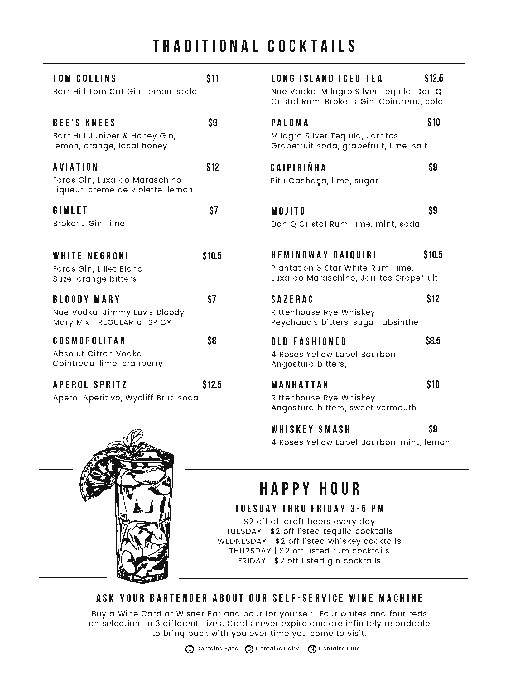
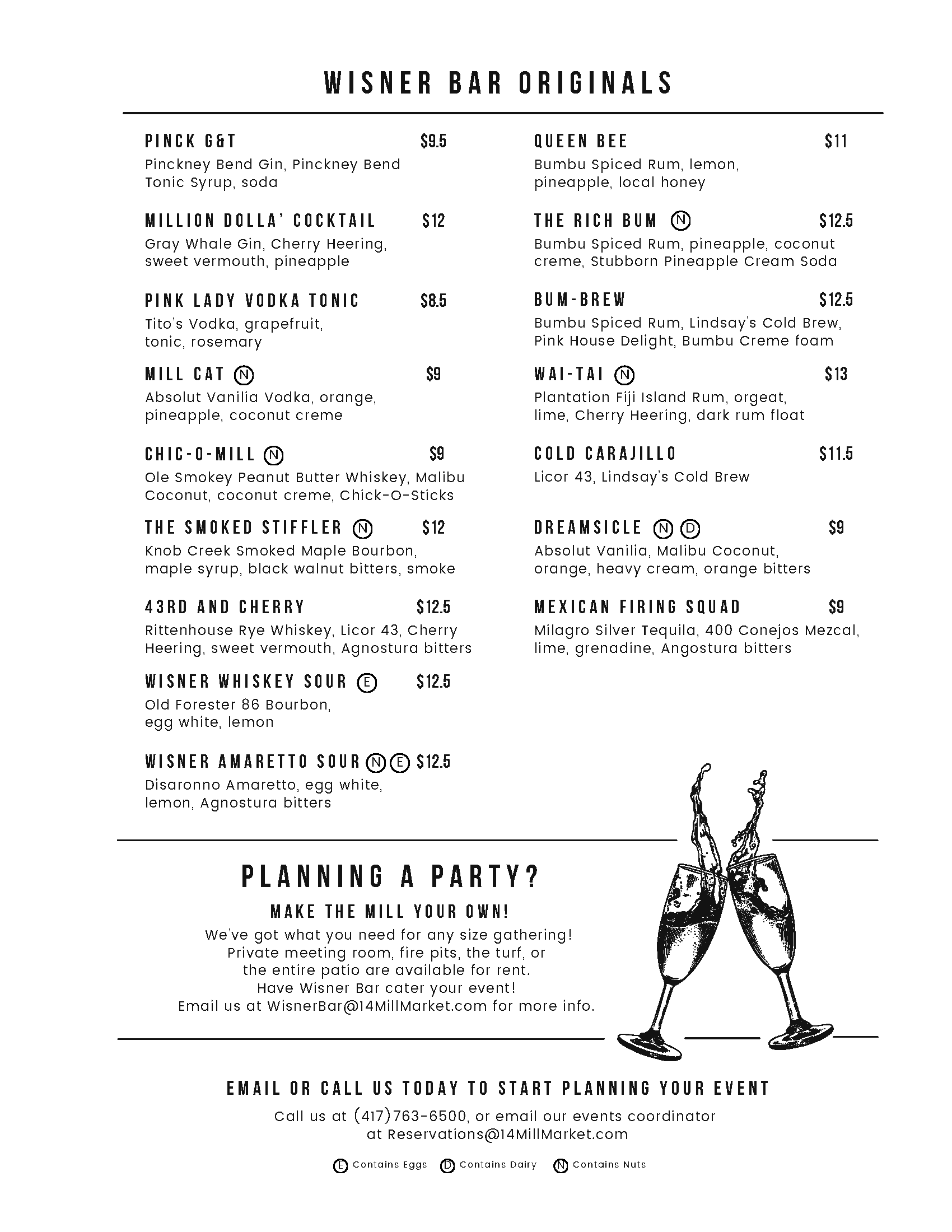
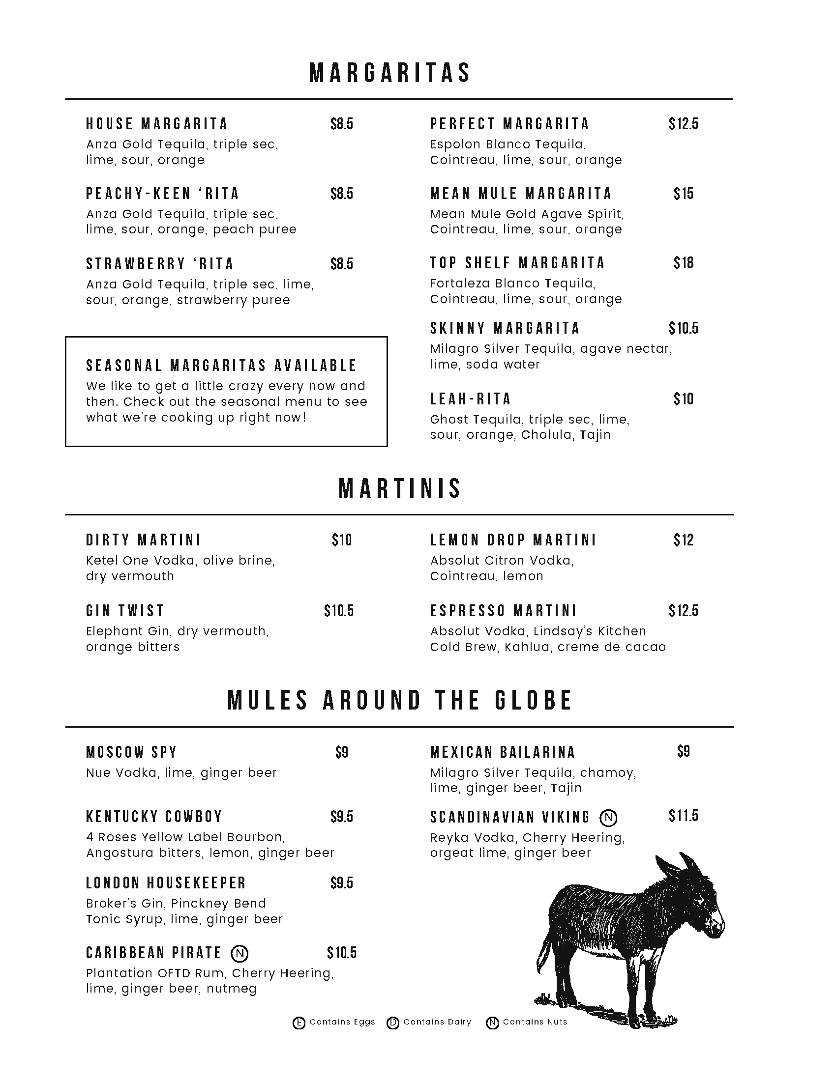
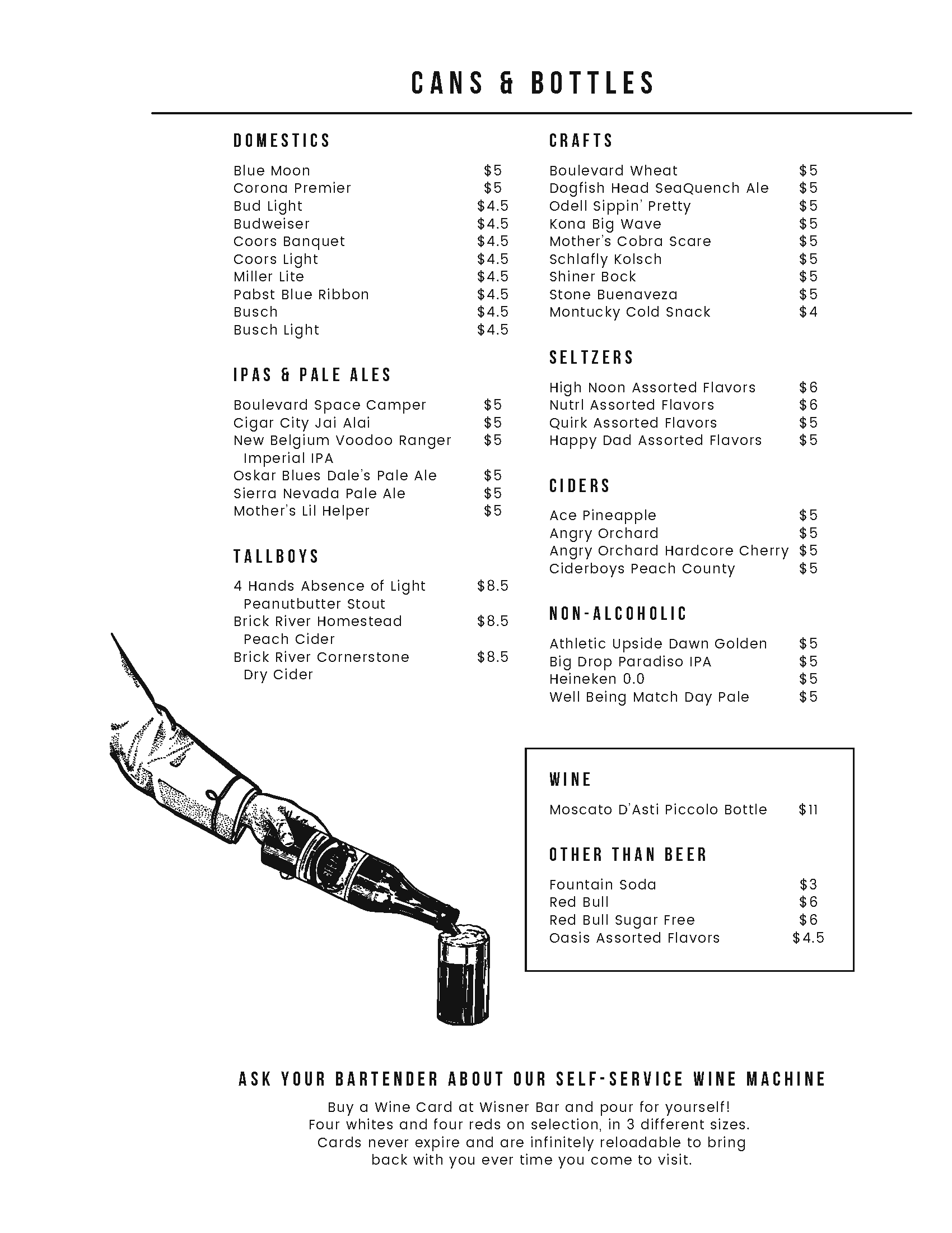
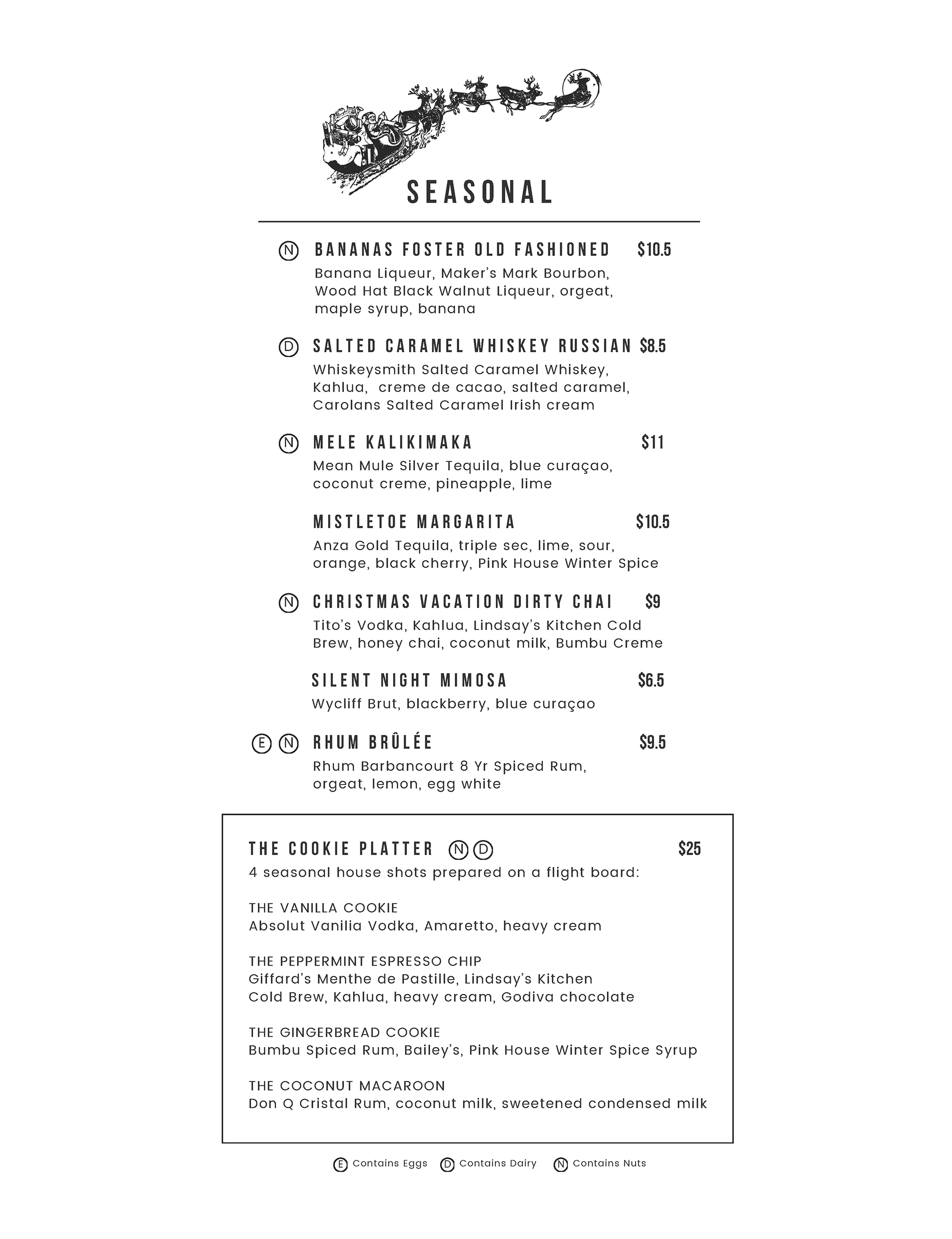
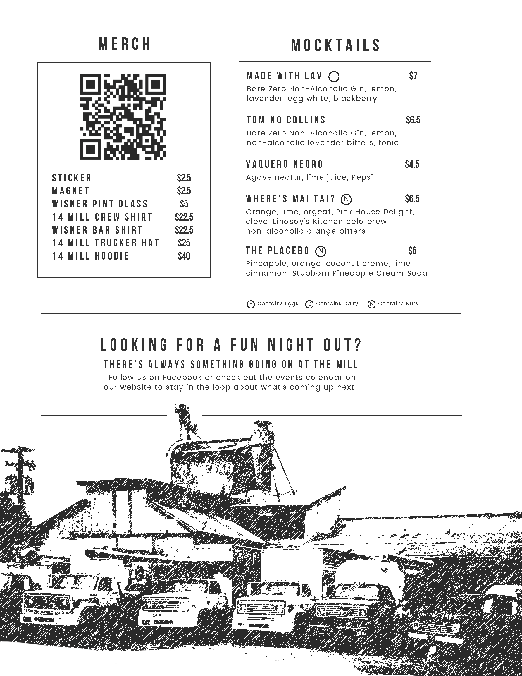
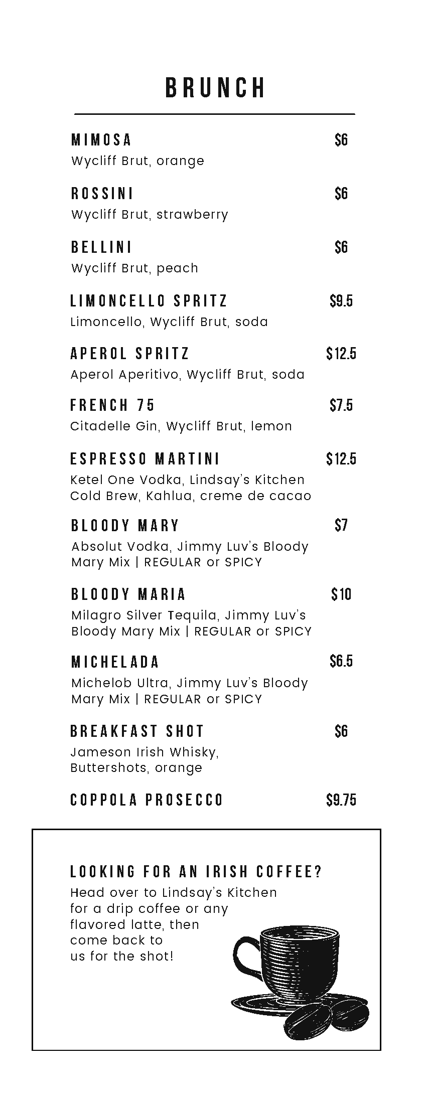
WISNER BAR AT 14 MILL MARKET
Custom wooden menu covers were purchased for the project, and hand-made, custom-built inserts were created which allowed the bar to frequently update and change sections or prices without needing to disassemble the whole menu or order expensive, heavy-duty prints. The custom inserts were made of thick, clear, archival plastic sleeves to protect the menu pages from spillage. The bar boasted large, rapidly-changing seasonal menus that required their physical counterparts to constantly keep up-to-date for customers. Using this method, the regular menu was built at US standard letter height, the rotating draft beer and brunch cocktail menus at a vertical half US letter, and seasonal menus were printed on colored paper and inserted, sized at a horizontal half US letter size. With these size changes, customers could easily spot the different sections and quickly find the information they needed.
LOCAL SMALL BUSINESS LOGOS
The rebranded logo for 417 Taphouse (branding was changed after a leadership restructure necessitated the removal of the existing logo from implementation) and a visually-corresponding but not too closely related logo for a new bar, Shot Shack, which opened as a sister location to Taphouse. Shot Shack was pitched as a "Hatfield & Mccoy-esque" venue decorated with antebellum Ozarkian charm and artifacts, and the menu was based on 100+ different shots which could be ordered, in lieu of an extensive cocktail menu.

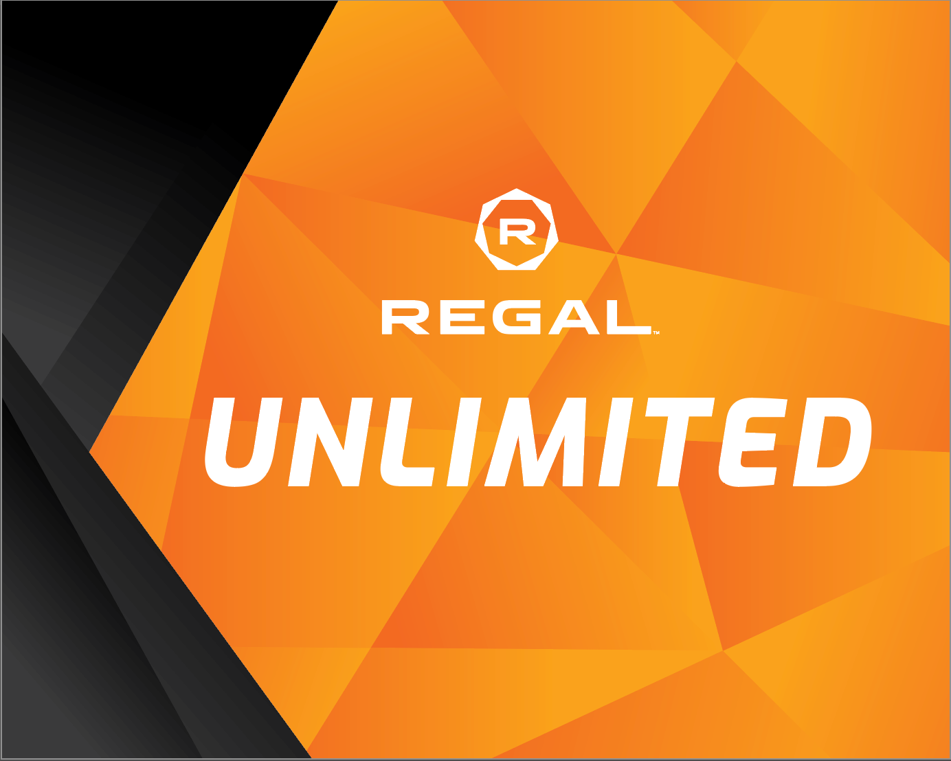
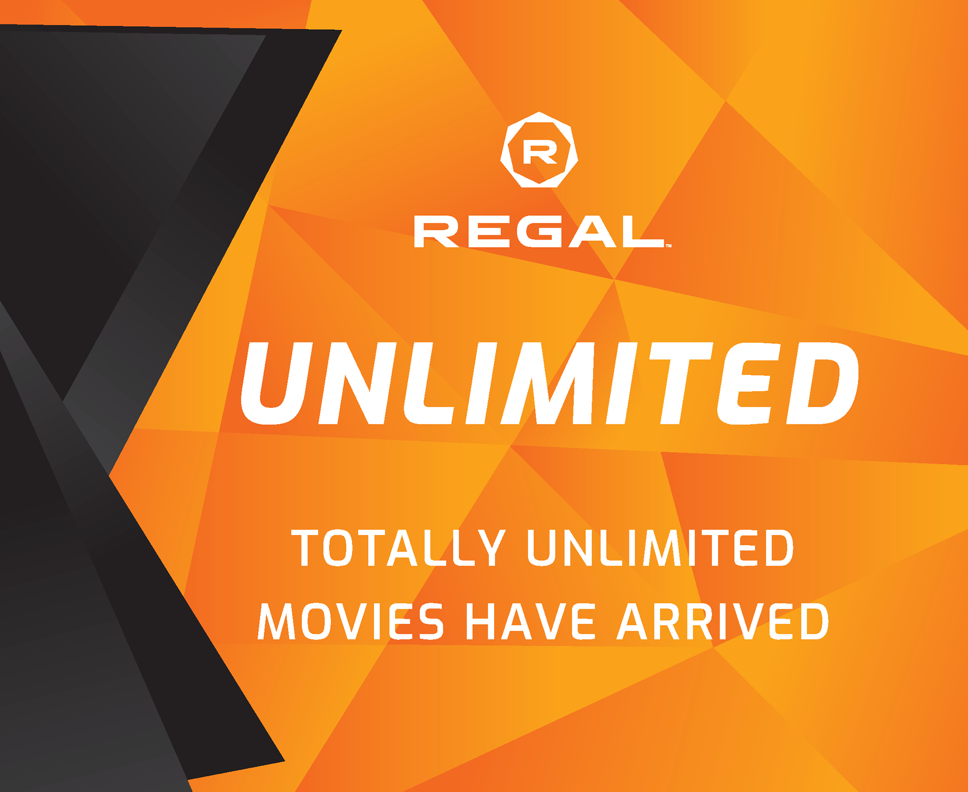
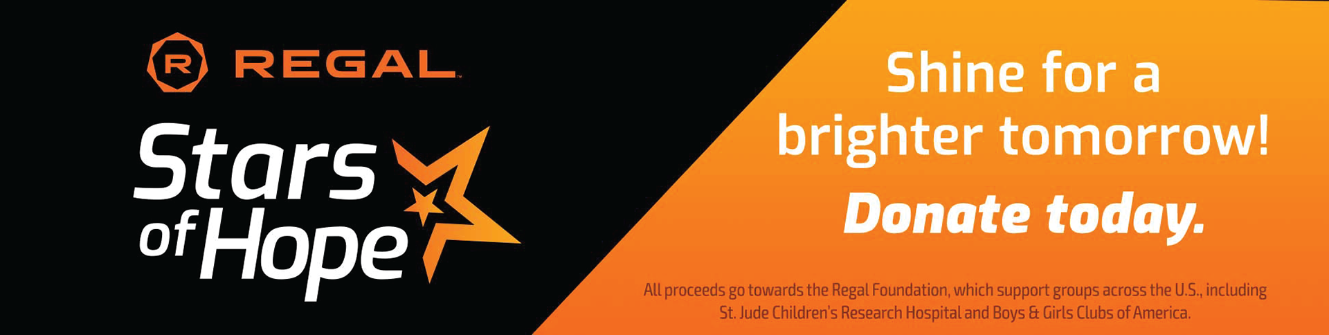
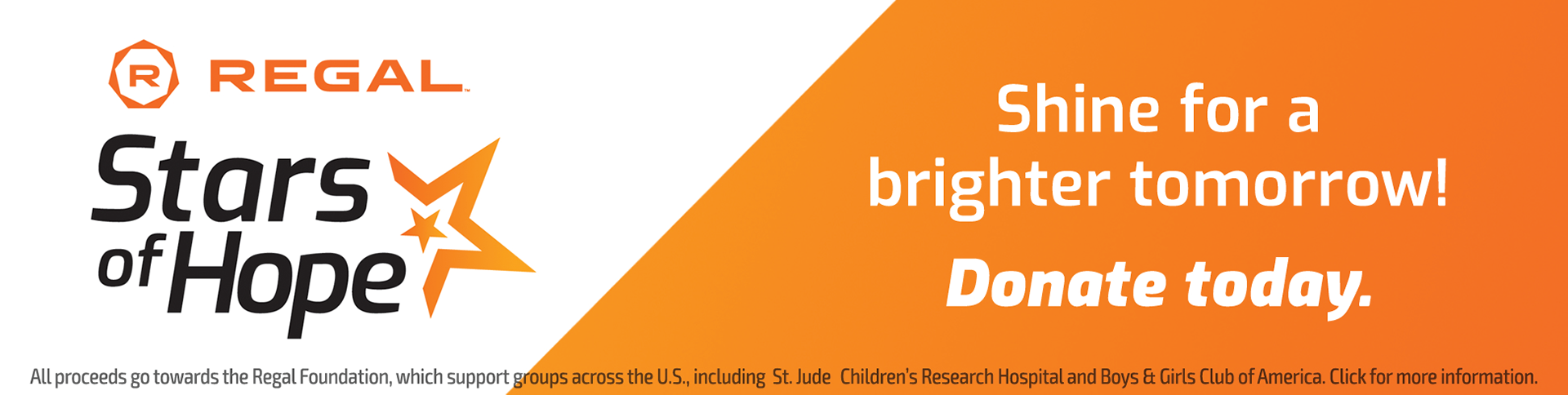
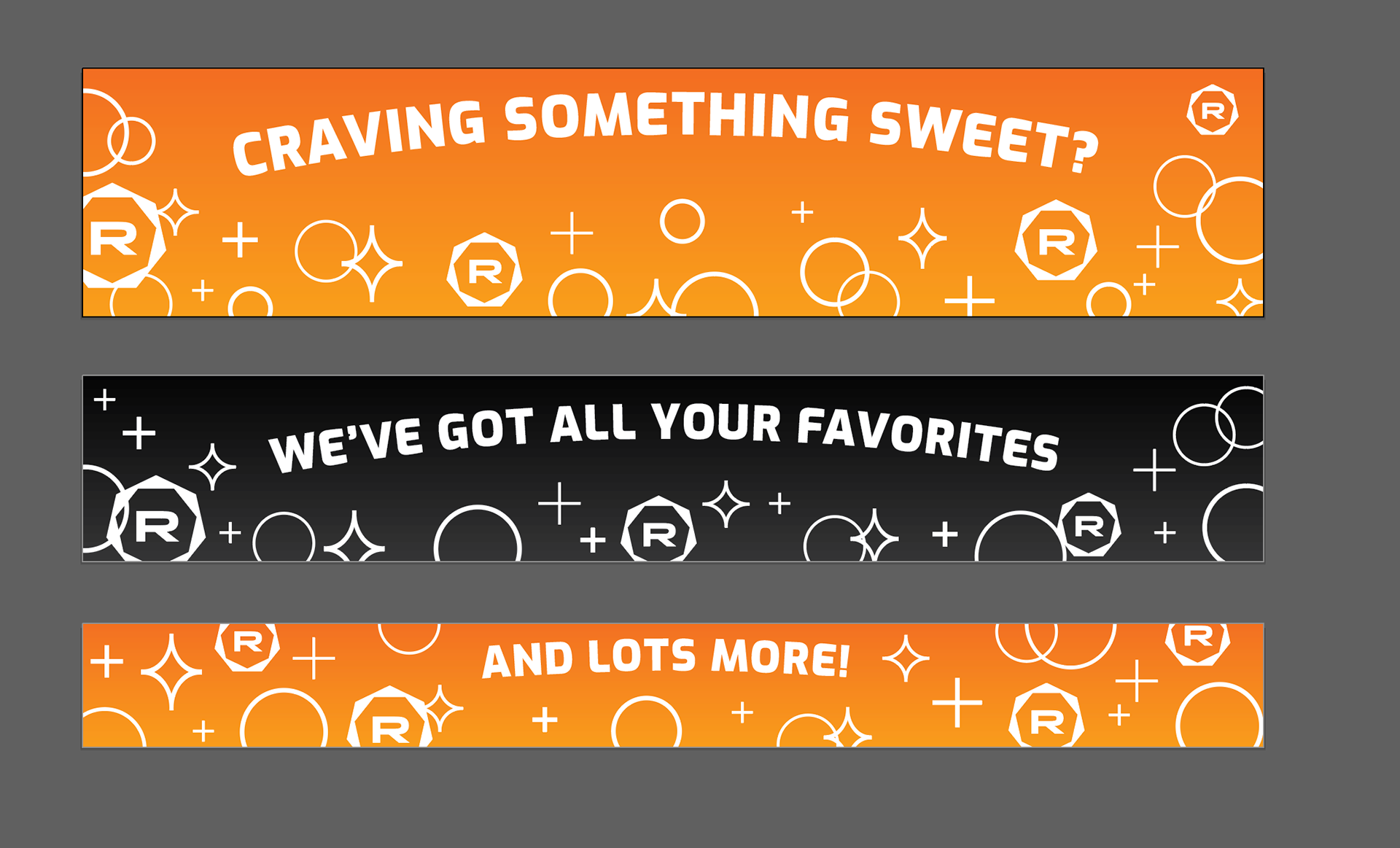
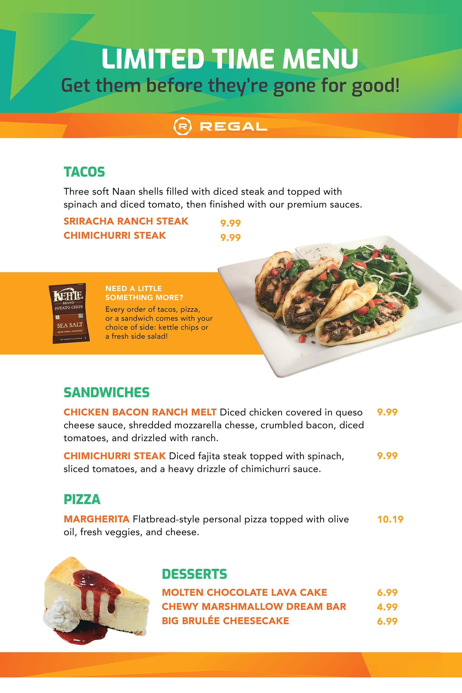
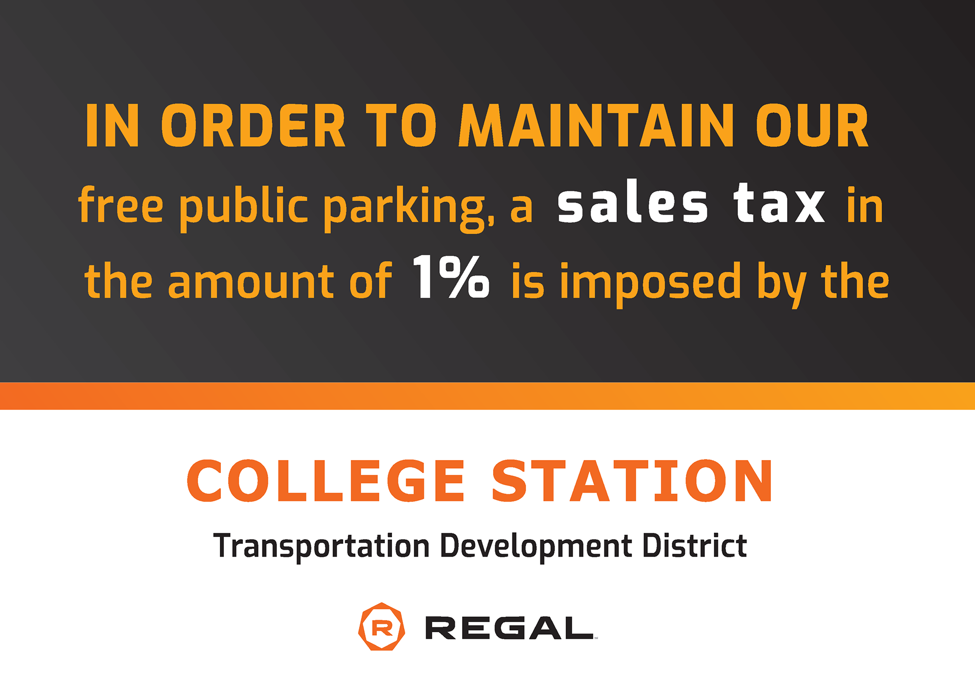
REGAL ENTERTAINMENT GROUP
Implementations made for a local Regal Cinemas movie theatre, within the branding guidelines of the established company, used for local promotional materials by the theatre.
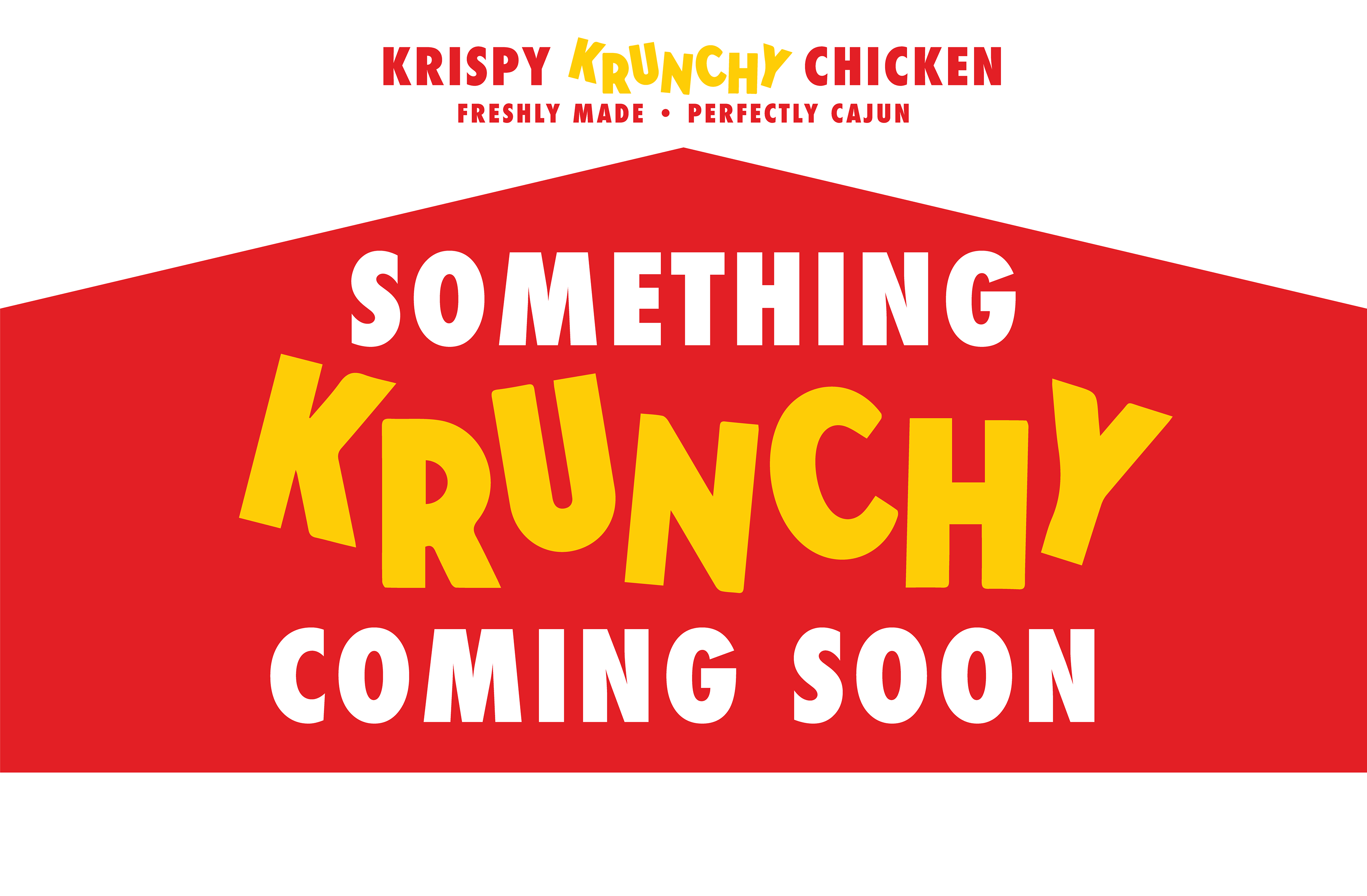
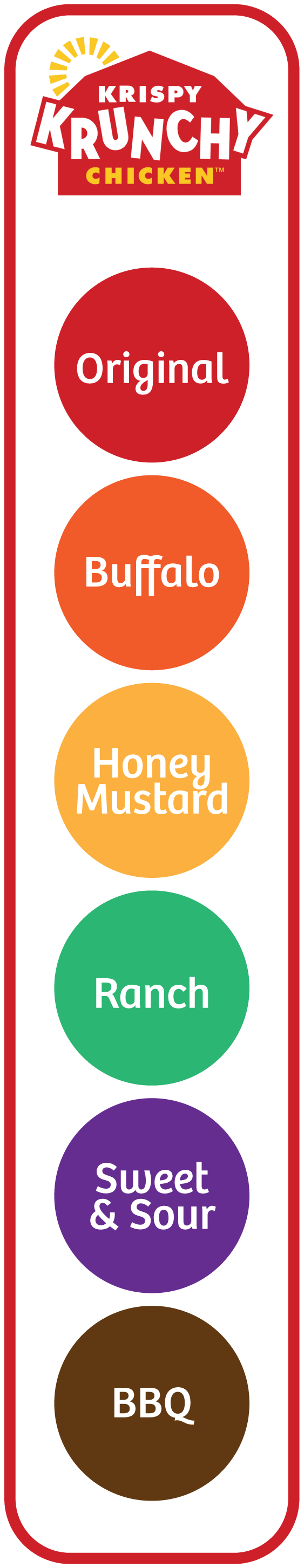
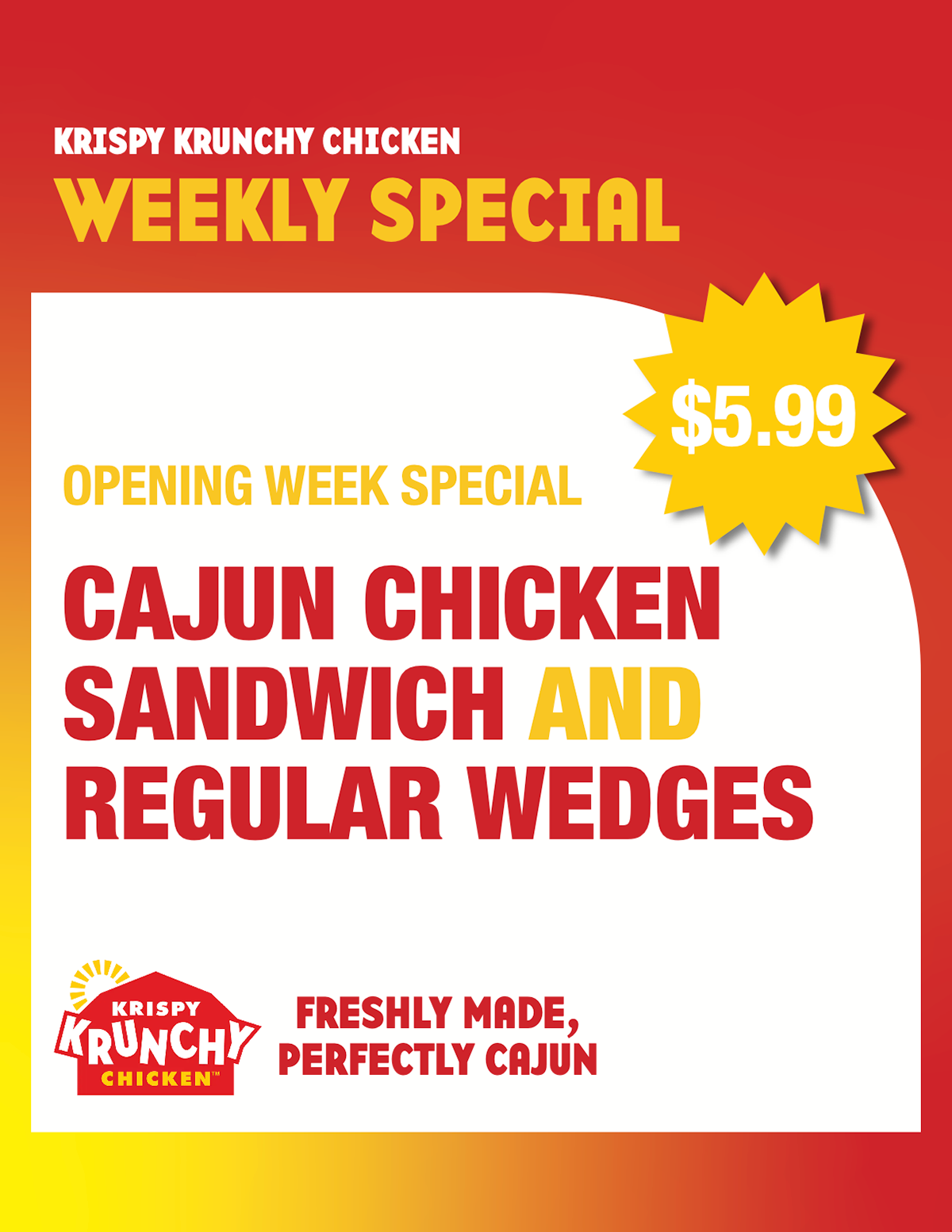
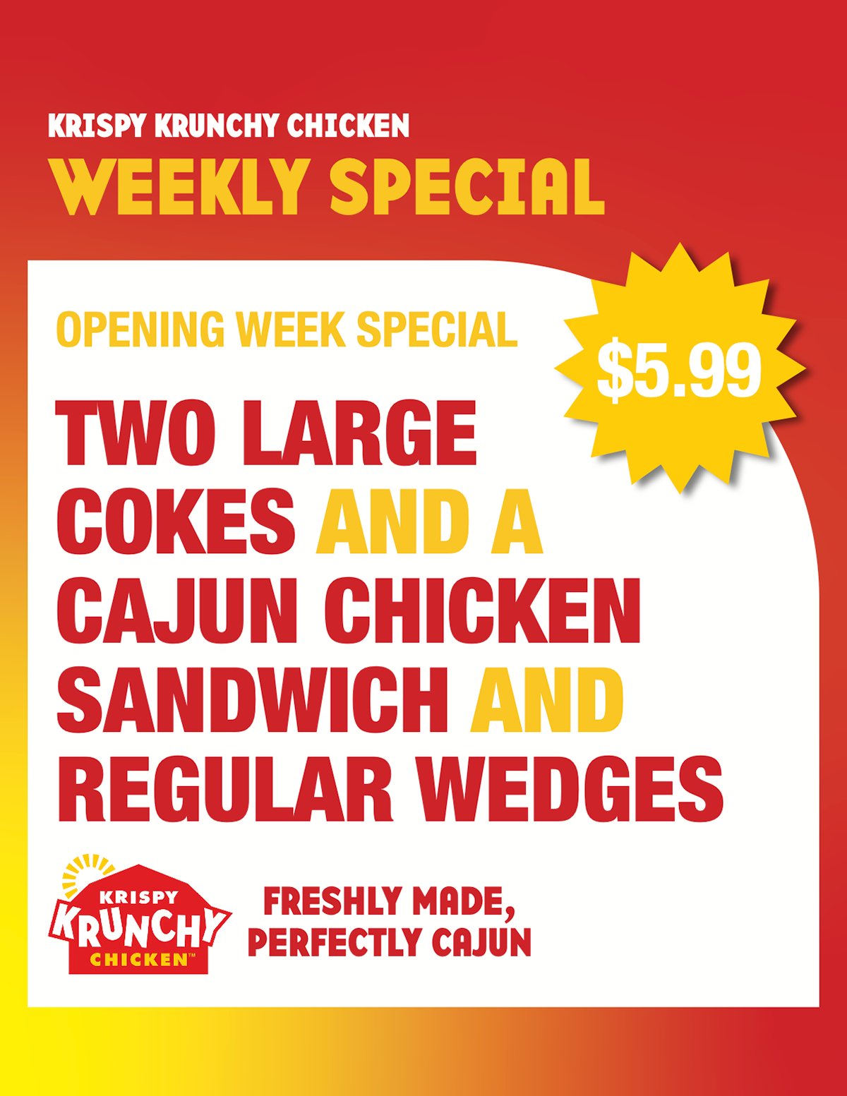
KRISPY KRUNCHY CHICKEN
Implementations made for a local Krispy Crunchy Chicken, within the branding guidelines of the established company, used for local promotional materials by the location.